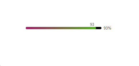
效果图
Main
import {

     useState } from 'react';
import styles from './style.less'

import Progress from './Progress'
const index = () =>
{


    const [count, setCount] = useState(50)
    return (
        <div className={

    styles.container}>
            <Progress percent={

    count} unSelectedColor={

    '#000'} strokeColor={

    {


                from: 'rgb(161, 29, 102)',
                to: 'rgb(83, 177, 36)',
            }} />
        </div>
    );
};
export default index
JS
import {
useState, useRef } from 'react';
import styles from './style.less'
const index = ({
percent, unSelectedColor, strokeColor }) =>
{
const [count, setCount] = useState(percent)
const myRef = useRef(null)
const bgDown = (e) =>
{
e = e || window.event
const {
nativeEvent: {
offsetX } } = e
setCount(Math.round(offsetX / myRef.current.clientWidth * 100))
myRef.current.addEventListener('mousemove', fn)
function fn (e)
{
const {
offsetX } = e
let newCount = Math.round(offsetX / myRef.current.clientWidth * 100)
newCount <= 100 ? setCount(newCount) : setCount(100)
}
document.addEventListener('mouseup', (() =>
{
myRef?.current?.removeEventListener('mousemove', fn);
}))
}
return (
<div className={
`${
styles.progress} ${
styles.progress_line} ${
styles.progress_show_info}`}>
<div className={
styles.progress_outer}>
<div id='inner' ref={
myRef} style={
{
backgroundColor: unSelectedColor && unSelectedColor }} onMouseDown={
bgDown} className={
styles.progress_inner}>
<div style={
{
width: `${
count}%`, backgroundImage: `linear-gradient(to right, ${
strokeColor['from']}, ${
strokeColor['to']}` }} className={
styles.progress_bg}>
<span>{
count}</span>
</div>
</div>
</div>
<span className={
styles.progress_text}>{
count}%</span>
</div>
);
};
export default index
CSS
.progress {


  box-sizing: border-box;
  margin: 0;
  padding: 0;
  color: rgba(0, 0, 0, 0.85);
  font-size: 14px;
  font-variant: tabular-nums;
  line-height: 1.5715;
  list-style: none;
  font-feature-settings: 'tnum', "tnum";
  display: inline-block;
}

.progress_line {


  position: relative;
  width: 100%;
  font-size: 14px;
}

.progress_outer {


  display: inline-block;
  width: 100%;
  margin-right: 0;
  padding-right: 0;
  margin-right: calc(-2em - 8px);
  padding-right: calc(2em + 8px);
}

.progress_inner {


  position: relative;
  display: inline-block;
  width: 100%;
  //   overflow: hidden;
  vertical-align: middle;
  background-color: #f5f5f5;
  border-radius: 100px;
  // ! 这里可以加个 padding 效果
  //   padding: 3px;
}

.progress_bg {


  position: relative;
  background-color: #1890ff;
  border-radius: 100px;
  transition: all 0.4s cubic-bezier(0.08, 0.82, 0.17, 1) 0s;

  height: 8px;

  &::before {


    position: absolute;
    top: 0;
    right: 0;
    bottom: 0;
    left: 0;
    background: #fff;
    border-radius: 10px;
    opacity: 0;
    animation: progress-active 2.4s cubic-bezier(0.23, 1, 0.32, 1) infinite;
    content: '';
  }

  &::after {


    content: "";
    display: inline-block;
    position: absolute;
    right: -4px;
    top: -8px;
    width: 0;
    height: 0;
    border-left: 4px solid transparent;
    border-right: 4px solid transparent;
    border-top: 3px solid #fff;
  }

  span {


    display: inline-block;
    position: absolute;
    right: 6px;
    top: -20px;
  }

  .progress-status-active .ant-progress-bg::before {


    position: absolute;
    top: 0;
    right: 0;
    bottom: 0;
    left: 0;
    background: #fff;
    border-radius: 10px;
    opacity: 0;
    animation: progress-active 2.4s cubic-bezier(0.23, 1, 0.32, 1) infinite;
    content: '';
  }

  @keyframes progress-active {


    0% {


      transform: translateX(-100%) scaleX(0);
      opacity: 0.1;
    }

    20% {


      transform: translateX(-100%) scaleX(0);
      opacity: 0.5;
    }

    100% {


      transform: translateX(0) scaleX(1);
      opacity: 0;
    }
  }
}

.progress_text {


  display: inline-block;
  width: 2em;
  margin-left: 8px;
  color: rgba(0, 0, 0, 0.85);
  font-size: 1em;
  line-height: 1;
  white-space: nowrap;
  text-align: left;
  vertical-align: middle;
  word-break: normal;
}