Loading 效果在网页中是不可或缺的组成部分。其作用在于让用户明晰页面正处于加载进程之中,从而提升用户体验。当用户访问网页时,倘若页面加载速度迟缓,且缺失 loading 效果,用户或许会心生焦虑与不耐烦,甚至误判页面无法加载。而一旦存在 loading 效果,用户便能知晓页面正在加载,明白等待时间是有限的,这能够增强用户的耐心以及等待的意愿。另外,loading 效果还能够为网页增添视觉吸引力,让页面显得更为生动有趣。
文中截取部分加载效果图
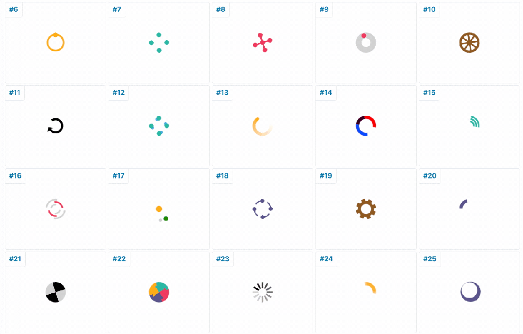
CSS Loaders是一个专门展示CSS加载动画的集合。它提供了超过600种仅使用CSS制作的加载动画,这些动画完全不需要JavaScript或其他库的支持。这意味着它们不仅易于实现,而且可以快速加载,对性能的影响极小。
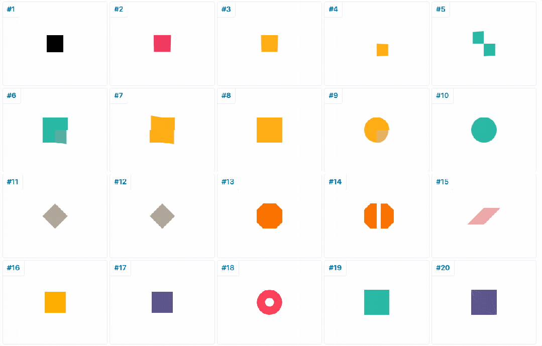
网站地址 : https://css-loaders.com/spinner/
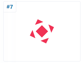
随便找了一个,顺便看了下复制出来的css,这几行就能写出来3D加载的效果,果然是大佬的手笔!
<!DOCTYPE html>
<html lang="en">

<head>
    <meta charset="UTF-8">
    <meta name="viewport" content="width=device-width, initial-scale=1.0">
    <title>Document</title>
    <style>
        .loader {


            width: 40px;
            aspect-ratio: 1;
            color: #f03355;
            position: relative;
            background:
                conic-gradient(from 134deg at top, currentColor 92deg, #0000 0) top,
                conic-gradient(from -46deg at bottom, currentColor 92deg, #0000 0) bottom;
            background-size: 100% 50%;
            background-repeat: no-repeat;
        }

        .loader:before {


            content: '';
            position: absolute;
            inset: 0;
            --g: currentColor 14.5px, #0000 0 calc(100% - 14.5px), currentColor 0;
            background:
                linear-gradient(45deg, var(--g)),
                linear-gradient(-45deg, var(--g));
            animation: l7 1.5s infinite cubic-bezier(0.3, 1, 0, 1);
        }

        @keyframes l7 {


            33% {


                inset: -10px;
                transform: rotate(0deg)
            }

            66% {


                inset: -10px;
                transform: rotate(90deg)
            }

            100% {


                inset: 0;
                transform: rotate(90deg)
            }
        }
    </style>
</head>

<body>
    <div class="loader"></div>

</body>

</html>