绘图基础
- Matplotlib 库太大,画图通常仅仅使用其中的核心模块 matplotlib.pyplot,并给其一个别名 plt,即 import matplotlib.pyplot as plt。
- 为了使图形在展示时能很好的嵌入到 Jupyter 的 Out[ ] 中,需要使用%matplotlib inline。
绘制图像
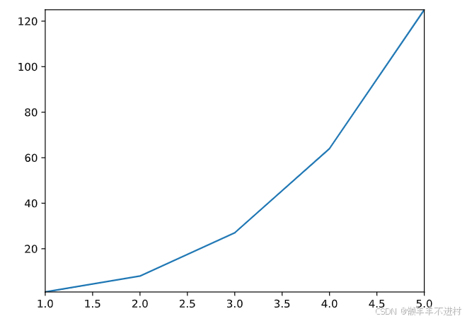
展示一个很简单的图形绘制示例,这个示例的代码就像在 Matlab 里一样。
import matplotlib.pyplot as plt
%matplotlib inline
# 绘制图像
Fig1 = plt.figure() # 创建新图窗
x = [ 1, 2, 3, 4, 5 ] # 数据的 x 值
y = [ 1, 8, 27, 64, 125 ] # 数据的 y 值
plt.plot(x,y) # plot 函数:先描点,再连线

这里绘制虽然很完美,但遗憾的是图形太浑浊。因此,需要下个示例的 In [3],即可在 Jupyter 中展示高清的 svg 矢量图。
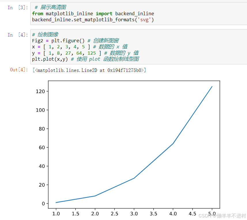
# 展示高清图
from matplotlib_inline import backend_inline
backend_inline.set_matplotlib_formats('svg')
# 绘制图像
Fig2 = plt.figure() # 创建新图窗
x = [ 1, 2, 3, 4, 5 ] # 数据的 x 值
y = [ 1, 8, 27, 64, 125 ] # 数据的 y 值
plt.plot(x,y) # 使用 plot 函数绘制线型图
保存图像
保存图形用.savefig( )方法,其需要一个 r 字符串:r’绝对路径\图形名.后缀’。
- 绝对路径:如果要保存到桌面,绝对路径即:C:\Users\用户名\Desktop;
- 后缀:可保存图形的格式很多,包括:eps、jpg、pdf、png、ps、svg 等。为了保存清晰的图,推荐保存至 svg 矢量格式,即
Fig2.savefig(r'C:\Users\zjj\Desktop\我的图.svg')
保存为 svg 格式后,可直接拖至 Word 或 Visio 中,即可显示高清矢量图。
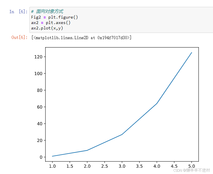
两种画图方式
Matplotlib 中有两种画图方式:Matlab 方式和面向对象方式。这两种方式都可以完成同一个目的,也可以相互转化
import matplotlib.pyplot as plt
%matplotlib inline
# 展示高清图
from matplotlib_inline import backend_inline
backend_inline.set_matplotlib_formats('svg')
# 准备数据
x = [ 1, 2, 3, 4, 5 ] # 数据的 x 值
y = [ 1, 8, 27, 64, 125 ] # 数据的 y 值
# Matlab 方式
Fig1 = plt.figure()
plt.plot(x,y)
# 面向对象方式
Fig2 = plt.figure()
ax2 = plt.axes()
ax2.plot(x,y)

图窗与坐标轴
- 图形窗口(figure)在 Matlab 中会单独弹出,该窗口中可容纳元素,也可以是空的窗口。在 Jupyter 中,由于我们将图形嵌入到了 Out [ ]中,所以不会看到有 figure 弹出。虽然看不到窗口,但在画图之前,仍然要手动 Fig1 =plt.figure()创建图窗,毕竟保存图形的.savefig( )方法是需要图形名,且后面几章会更加强调。
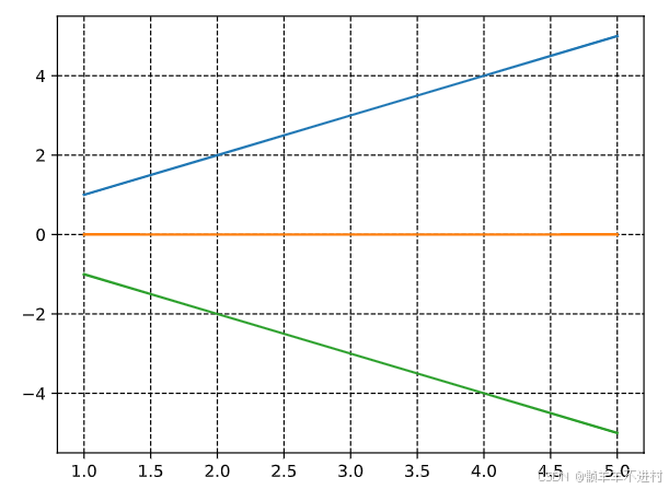
- 坐标轴(axes)是一个矩形,其下方是 x 轴的数值与刻度,左侧是 y 轴的数值与刻度。因此,将 1.4 示例的 Out [4]中的蓝色曲线删除,剩余部分全是 axes。
多图形绘制
在 Jupyter 的某个代码块中使用 Fig1=plt.figure()创建图窗后,其范围仅仅在此代码块内,跳出此代码块外的其它画图命令将与 Fig1 无关。因此,画一幅图,请在一个代码块内完成,不得分块。
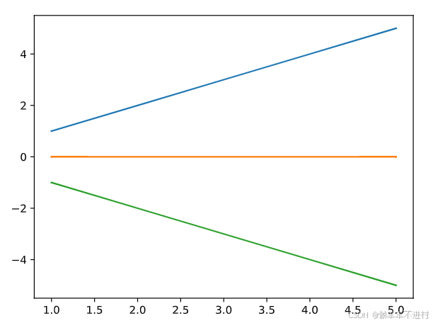
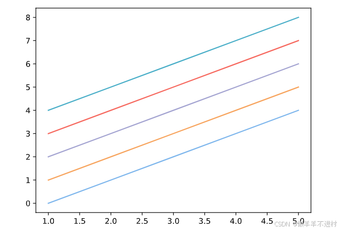
绘制多线条
在同一个图窗内绘制多线条,按两种画图方式分开来演示。
import matplotlib.pyplot as plt
%matplotlib inline
# 展示高清图
from matplotlib_inline import backend_inline
backend_inline.set_matplotlib_formats('svg')
# 准备数据
x = [ 1, 2, 3, 4, 5 ] # 数据的 x 值
y1 = [ 1, 2, 3, 4, 5 ] # 数据的 y1 值
y2 = [ 0, 0, 0, 0, 0 ] # 数据的 y2 值
y3 = [ -1, -2, -3, -4, -5 ] # 数据的 y3 值
# Matlab 方式
Fig1 = plt.figure()
plt.plot(x,y1)
plt.plot(x,y2)
plt.plot(x,y3)
# 面向对象方式
Fig2 = plt.figure()
ax2 = plt.axes()
ax2.plot(x,y1)
ax2.plot(x,y2)
ax2.plot(x,y3)
绘制多子图
绘制多个子图时,两种方法可能区别较大,如示例所示。
import matplotlib.pyplot as plt
%matplotlib inline
# 展示高清图
from matplotlib_inline import backend_inline
backend_inline.set_matplotlib_formats('svg')
# 准备数据
x = [ 1, 2, 3, 4, 5 ] # 数据的 x 值
y1 = [ 1, 2, 3, 4, 5 ] # 数据的 y1 值
y2 = [ 0, 0, 0, 0, 0 ] # 数据的 y2 值
y3 = [ -1, -2, -3, -4, -5 ] # 数据的 y3 值
# Matlab 方式
Fig1 = plt.figure()
plt.subplot(3,1,1), plt.plot(x,y1)
plt.subplot(3,1,2), plt.plot(x,y2)
plt.subplot(3,1,3), plt.plot(x,y3)
# 面向对象方式
Fig2, ax2 = plt.subplots(3)
ax2[0].plot(x,y1)
ax2[1].plot(x,y2)
ax2[2].plot(x,y3)
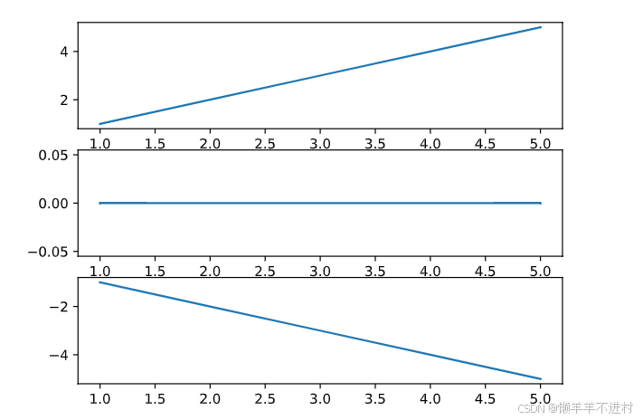
在上述示例中,注意到用 Fig2, ax2 =plt.subplots(3)一行代码替代了之前的两行代码 Fig2 = plt.figure()与 ax2 = plt.axes()。因此,之后可以直接使用 Fig2, ax2 =plt.subplots()简化面向对象方式的代码。
图表类型
图表类型
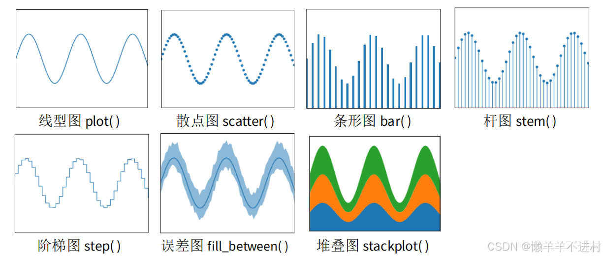
plt 提供 5 类基本图表,分别是二维图、网格图、统计图、轮廓图、三维图。详见https://matplotlib.org/stable/plot_types/index,以下罗列深度学习中可能用的。
-
二维图
二维图,只需要两个向量即可绘图,其中线型图可以替代其它所有二维图。
-
网格图
网格图,只需要一个矩阵即可绘图,以下网格图都有一定的实用价值。
-
统计图
统计图,一般做数据分析时使用。

- 以上图形只会挑选其中最关键、使用最频繁的函数进行讲解。其它情况可百度或者去官网查看使用方法。
- 除了上述链接中的这五类基本图表外,还有更多作者提前画好的花哨的靓图,
详见 https://matplotlib.org/stable/gallery/index.html。 - 最后,作者还温馨地向小白的我们提供了从 0 开始到大神的完整教程,详见:https://matplotlib.org/stable/tutorials/index.html。
二维图
二维图,仅演示 plot 线型图函数,只因其可以替代其它所有二维图。
- 设置颜色
plot()函数含 color 参数,可以设置线条的颜色,如示例所示。
import matplotlib.pyplot as plt
%matplotlib inline
 # 展示高清图
from matplotlib_inline import backend_inline
backend_inline.set_matplotlib_formats('svg')
# 准备数据
x = [ 1, 2, 3, 4, 5 ] # 数据的 x 值
y1 = [ 0, 1, 2, 3, 4 ] # 数据的 y1 值
y2 = [ 1, 2, 3, 4, 5 ] # 数据的 y2 值
y3 = [ 2, 3, 4, 5, 6 ] # 数据的 y3 值
y4 = [ 3, 4, 5, 6, 7 ] # 数据的 y4 值
y5 = [ 4, 5, 6, 7, 8 ] # 数据的 y5 值
# Matlab 方式
Fig1 = plt.figure()
plt.plot(x, y1, color='#7CB5EC')
plt.plot(x, y2, color='#F7A35C')
plt.plot(x, y3, color='#A2A2D0')
plt.plot(x, y4, color='#F6675D')
plt.plot(x, y5, color='#47ADC7')
# 面向对象方式
Fig2, ax2 = plt.subplots()
ax2.plot(x, y1, color='#7CB5EC')
ax2.plot(x, y2, color='#F7A35C')
ax2.plot(x, y3, color='#A2A2D0')
ax2.plot(x, y4, color='#F6675D')
ax2.plot(x, y5, color='#47ADC7')
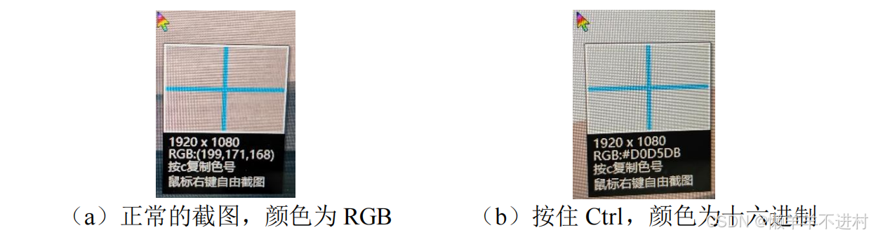
上示例中,颜色以十六进制存储,十六进制可通过 QQ 截图的取色功能获取。在 QQ 登录的状态下,按下 Ctrl+Alt 与 A,鼠标移动时如图a所示,当按住 Ctrl 时,可切换到图b,最后按 c 即可取色。
2. 设置粗细
plot()函数含 linestyle 参数,可以设置线条的风格,如示例所示。
# Matlab 方式
Fig1 = plt.figure()
plt.plot(x, y1, linestyle='-')
plt.plot(x, y2, linestyle='--')
plt.plot(x, y3, linestyle='-.')
plt.plot(x, y4, linestyle=':')
plt.plot(x, y5, linestyle=' ')
# 面向对象方式
Fig2, ax2 = plt.subplots()
ax2.plot(x, y1, linestyle='-')
ax2.plot(x, y2, linestyle='--')
ax2.plot(x, y3, linestyle='-.')
ax2.plot(x, y4, linestyle=':')
ax2.plot(x, y5, linestyle=' ')
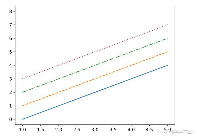 在设置线条风格时,'-‘表示实线,’–‘表示虚线,’-.‘表示点虚线,’:‘表示点线,’ '表示隐藏该线条。
3. 设置粗细
plot()函数含 linewidth 参数,可以设置线条的粗细,如示例所示。
# Matlab 方式
Fig1 = plt.figure()
plt.plot(x, y1, linewidth=0.5)
plt.plot(x, y2, linewidth=1)
plt.plot(x, y3, linewidth=1.5)
plt.plot(x, y4, linewidth=2)
# 面向对象方式
Fig2, ax2 = plt.subplots()
ax2.plot(x, y1, linewidth=0.5)
ax2.plot(x, y2, linewidth=1)
ax2.plot(x, y3, linewidth=1.5)
ax2.plot(x, y4, linewidth=2)
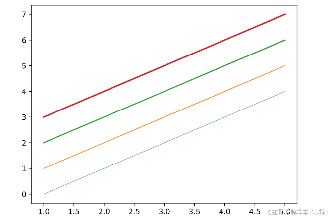
在设置线条粗细时,数字表示磅数,一般以 0.5 至 3 为宜。
- 设置标记
plot()函数含 marker 参数,可以设置线条的标记,如示例所示。
# Matlab 方式
Fig1 = plt.figure()
plt.plot(x, y1, marker='.')
plt.plot(x, y2, marker='o')
plt.plot(x, y3, marker='^')
plt.plot(x, y4, marker='s')
plt.plot(x, y5, marker='D')
# 面向对象方式
Fig2, ax2 = plt.subplots()
ax2.plot(x, y1, marker='.')
ax2.plot(x, y2, marker='o')
ax2.plot(x, y3, marker='^')
ax2.plot(x, y4, marker='s')
ax2.plot(x, y5, marker='D')
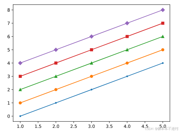
标记的尺寸可以由 markersize 参数调整,其值以 3 至 9 为宜。
- 综合运用
现综合上述所有的线条属性,绘制图形如示例所示
# Matlab 方式
Fig1 = plt.figure()
plt.plot(x, y1, color='#7CB5EC', linestyle='-', linewidth=2, marker='o', markersize=6)
plt.plot(x, y2, color='#F7A35C', linestyle='--', linewidth=2, marker='^', markersize=6)
plt.plot(x, y3, color='#A2A2D0', linestyle='-.', linewidth=2, marker='s', markersize=6)
plt.plot(x, y4, color='#F6675D', linestyle=':', linewidth=2, marker='D', markersize=6)
plt.plot(x, y5, color='#47ADC7', linestyle=' ', linewidth=2, marker='o', markersize=6)
# 面向对象方式
Fig2, ax2 = plt.subplots()
ax2.plot(x, y1, color='#7CB5EC', linestyle='-', linewidth=2, marker='o', markersize=6)
ax2.plot(x, y2, color='#F7A35C', linestyle='--', linewidth=2, marker='^', markersize=6)
ax2.plot(x, y3, color='#A2A2D0', linestyle='-.', linewidth=2, marker='s', markersize=6)
ax2.plot(x, y4, color='#F6675D', linestyle=':', linewidth=2, marker='D', markersize=6)
ax2.plot(x, y5, color='#47ADC7', linestyle=' ', linewidth=2, marker='o', markersize=6)

请留意 y5 的线条,此时为散点,这种方式画散点图比 plt.scatter( )效率更高
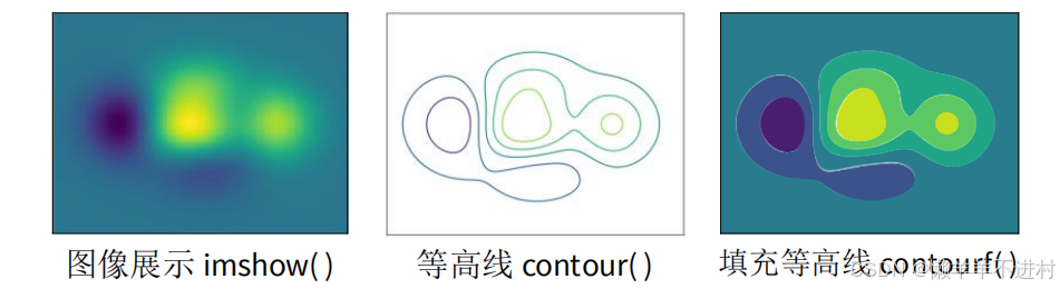
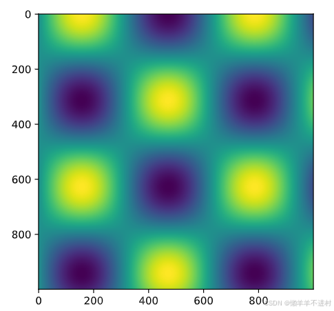
网格图
网格图,仅演示 imshow 函数,只因另外两个在深度学习中几乎用不到。
import matplotlib.pyplot as plt
%matplotlib inline
# 展示高清图
from matplotlib_inline import backend_inline
backend_inline.set_matplotlib_formats('svg')
# 准备数据
import numpy as np
x = np.linspace(0,10,1000)
I = np.sin(x) * np.cos(x).reshape(-1,1)
# Matlab 方式
Fig1 = plt.figure()
plt.imshow(I)
# 面向对象方式
Fig2, ax2 = plt.subplots()
ax2.imshow(I)
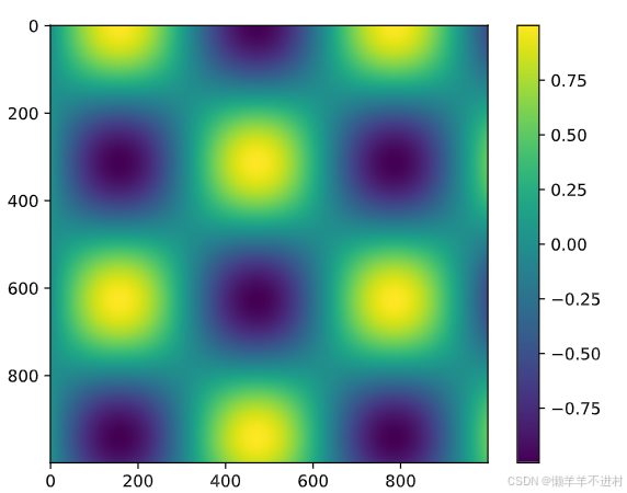
在所有的网格图中,还可以配置颜色条,但遗憾的是,面向对象方式此功能似乎是缺失的,因此只能在 Matlab 方式中进行此操作。
# Matlab 方式
Fig1 = plt.figure()
plt.imshow(I)
plt.colorbar()
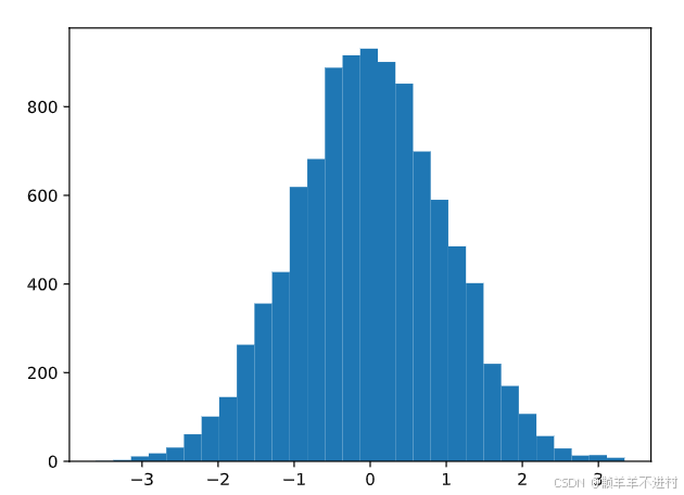
统计图
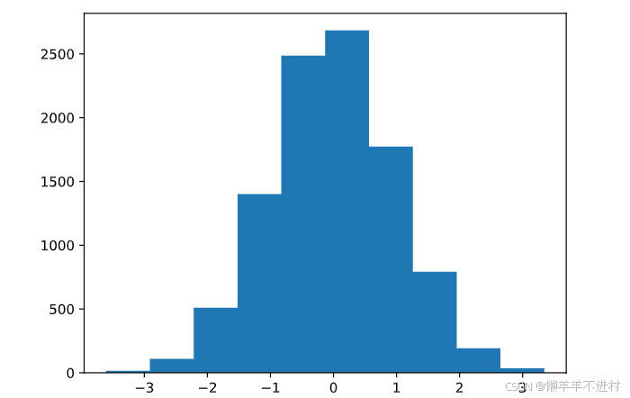
统计图,仅演示 hist 函数,只因其它函数主要出现在数据分析领域。
为避免将直方图 hist 与条形图 bar 弄混,现说明:条形图 bar 可用 plot 替代;hist 则是统计学的函数,是为了看清某分布的均值与标准差
import matplotlib.pyplot as plt
%matplotlib inline
 # 展示高清图
from matplotlib_inline import backend_inline
backend_inline.set_matplotlib_formats('svg')
# 创建 10000 个标准正态分布的样本
import numpy as np
data = np.random.randn( 10000 )
 # Matlab 方式
Fig1 = plt.figure()
plt.hist( data )
# 面向对象方式
Fig2, ax2 = plt.subplots()
ax2.hist( data )

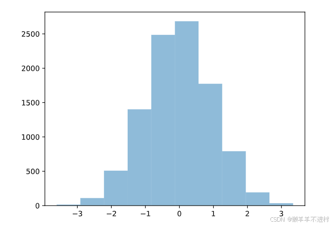
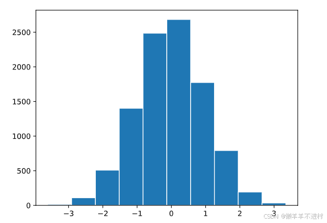
- 区间个数
bins 参数即区间划分的数量,默认为 10,现将其改为为 30
# Matlab 方式
Fig1 = plt.figure()
plt.hist( data, bins = 30 )
# 面向对象方式
Fig2, ax2 = plt.subplots()
ax2.hist( data, bins = 30 )
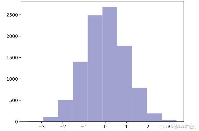
2. 透明度
Alpha 参数表示透明度,默认为 1,现将其改为为 0.5
# Matlab 方式
Fig1 = plt.figure()
plt.hist( data, alpha=0.5 )
# 面向对象方式
Fig2, ax2 = plt.subplots()
ax2.hist( data, alpha=0.5 )
3. 图表类型
histtype 表示类型,默认为’bar’,现将其改为为’stepfilled’,图形浑然一体。
# Matlab 方式
Fig1 = plt.figure()
plt.hist( data, histtype='stepfilled')
# 面向对象方式
Fig2, ax2 = plt.subplots()
ax2.hist( data, histtype='stepfilled' )
4. 直方图颜色
color 表示直方图的颜色,这里进行更改。
# Matlab 方式
Fig1 = plt.figure()
plt.hist( data, color='#A2A2D0' )
# 面向对象方式
Fig2, ax2 = plt.subplots()
ax2.hist( data, color='#A2A2D0' )
5. 边缘颜色
edgecolor 表示直方图边缘的颜色,这里改为白色。
# Matlab 方式
Fig1 = plt.figure()
plt.hist( data, edgecolor='#FFFFFF )
# 面向对象方式
Fig2, ax2 = plt.subplots()
ax2.hist( data, edgecolor='#FFFFFF' )
6. 综合应运
# 创建三个正态分布的样本
import numpy as np
x1 = np.random.normal( 3, 1, 1000 )
x2 = np.random.normal( 6, 1, 1000 )
x3 = np.random.normal( 9, 1, 1000 )
# Matlab 方式
Fig1 = plt.figure()
plt.hist( x1, bins=30, alpha=0.5, color='#7CB5EC', edgecolor='#FFFFFF' )
plt.hist( x2, bins=30, alpha=0.5, color='#A2A2D0', edgecolor='#FFFFFF' )
plt.hist( x3, bins=30, alpha=0.5, color='#47ADC7', edgecolor='#FFFFFF' )
# 面向对象方式
Fig2, ax2 = plt.subplots()
ax2.hist( x1, bins=30, alpha=0.5, histtype='stepfilled', color='#7CB5EC' )
ax2.hist( x2, bins=30, alpha=0.5, histtype='stepfilled', color='#A2A2D0' )
ax2.hist( x3, bins=30, alpha=0.5, histtype='stepfilled', color='#47ADC7' )

图窗属性
坐标轴上下限
尽管 Matplotlib 会自动调整图窗为最佳的坐标轴上下限,但我们知道,很多时候仍需手动设置,才能适应当时的情况。
import matplotlib.pyplot as plt
%matplotlib inline
# 展示高清图
from matplotlib_inline import backend_inline
backend_inline.set_matplotlib_formats('svg')
# 准备数据
x = [ 1, 2, 3, 4, 5 ] # 数据的 x 值
y = [ 1, 8, 27, 64, 125 ] # 数据的 y 值
- lim发
使用 lim 法时,Matlab 方式与面向对象方式首次出现区别。
# Matlab 方式(lim 法)
Fig1 = plt.figure()
plt.plot(x,y)
plt.xlim(1,5)
plt.ylim(1,125)
# 面向对象方式(lim 法)
Fig2, ax2 = plt.subplots()
ax2.plot(x,y)
ax2.set_xlim(1,5)
ax2.set_ylim(1,125)
2. axis法
# Matlab 方式(axis 法)
Fig5 = plt.figure()
plt.plot(x,y)
plt.axis([1, 5, 1, 125])
# 面向对象方式(axis 法)
Fig6, ax6 = plt.subplots()
ax6.plot(x,y)
ax6.axis([1, 5, 1, 125])

还可以使用 plt.axis(‘equal’)使 x 轴与 y 轴的比例达到 1:1,长度等长。
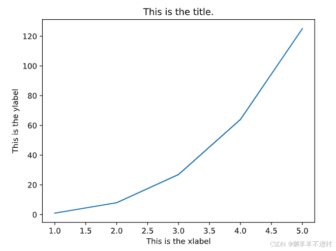
标题与轴名称
在这里,Matlab 方式与面向对象方式将最后一次出现区别,如示例所示。
import matplotlib.pyplot as plt
%matplotlib inline
# 展示高清图
from matplotlib_inline import backend_inline
backend_inline.set_matplotlib_formats('svg')
# 准备数据
x = [ 1, 2, 3, 4, 5 ] # 数据的 x 值
y = [ 1, 8, 27, 64, 125 ] # 数据的 y 值
# Matlab 方式
Fig1 = plt.figure()
plt.plot(x,y)
plt.title('This is the title.')
plt.xlabel('This is the xlabel')
plt.ylabel('This is the ylabel')
# 面向对象方式
Fig2, ax2 = plt.subplots()
ax2.plot(x,y)
ax2.set_title('This is the title.')
ax2.set_xlabel('This is the xlabel')
ax2.set_ylabel('This is the ylabel')
面向对象方式有变体的地方:
| MATLAB方式 | 面相对象的方式 |
|---|---|
| plt.xlim( ) | ax.set_xlim( ) |
| plt.ylim( ) | ax.set_ylim( ) |
| plt.title( ) | ax.set_title( ) |
| plt.xlabel( ) | ax.set_xlabel( ) |
| plt.ylabel( ) | ax.set_ylabel( ) |
| 当然,面向对象方式统一了这五个函数,结合成了一个,即 |
ax2.set( xlim=( ), ylim=( ), title=' ', xlabel=' ', ylabel=' ' )
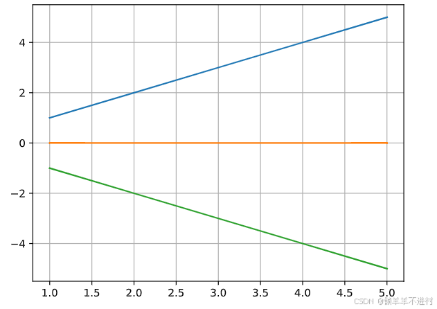
图例
一般图例会出现在二维图与统计图中,网格图则用的是颜色条。
import matplotlib.pyplot as plt
%matplotlib inline
# 展示高清图
from matplotlib_inline import backend_inline
backend_inline.set_matplotlib_formats('svg')
 # 准备数据
x = [ 1, 2, 3, 4, 5 ] # 数据的 x 值
y1 = [ 1, 2, 3, 4, 5 ] # 数据的 y1 值
y2 = [ 0, 0, 0, 0, 0 ] # 数据的 y2 值
y3 = [ -1, -2, -3, -4, -5 ] # 数据的 y3 值
 # Matlab 方式
Fig1 = plt.figure()
plt.plot(x, y1, label='y=x')
plt.plot(x, y2, label='y=0')
plt.plot(x, y3, label='y=-x')
plt.legend()
# 面向对象方式
Fig2, ax2 = plt.subplots()
ax2.plot(x ,y1, label='y=x')
ax2.plot(x ,y2, label='y=0')
ax2.plot(x ,y3, label='y=-x')
ax2.legend()

如果你不想展示某些线条的图例,只需要去除该函数中的 label 关键字即可(除了 plot 外,其它画图函数也携带 label 关键字参数)。
当然,有些教程不使用 label 关键字参数,使用下个示例的操作来替代上面的 In [4],如若遇到了 In [5]这种代码,大家能看懂就行。
# Matlab 方式
Fig3 = plt.figure()
plt.plot(x,y1)
plt.plot(x,y2)
plt.plot(x,y3)
plt.legend(['y=x', 'y=0', 'y=-x'])
# 面向对象方式
Fig4, ax4 = plt.subplots()
ax4.plot(x,y1)
ax4.plot(x,y2)
ax4.plot(x,y3)
ax4.legend(['y=x', 'y=0', 'y=-x'])
legend 还有三个常用的关键字参数:loc、frameon 和 ncol。
- loc 用于表示图例位置,该关键字在 upper、center、lower 中选一个,在left、center、right 中选一个,用法如 loc=‘upper right’,也可以 loc=‘best’。
- frameon 用于表示图例边框,去边框是 frameon=False。
- ncol 用于表示图例的列数,默认是 1 列,也可以通过 ncol=2 调为 2 列。
网格
给图形加上网格,美观又好看。
# Matlab 方式
Fig1 = plt.figure()
plt.plot(x, y1)
plt.plot(x, y2)
plt.plot(x, y3)
plt.grid()
# 面向对象方式
Fig2, ax2 = plt.subplots()
ax2.plot(x, y1)
ax2.plot(x, y2)
ax2.plot(x, y3)
ax2.grid()
当然,grid()函数还有 color 与 linestyle 两个参数,这与 plot 里用法一致。
# Matlab 方式
Fig1 = plt.figure()
plt.plot(x, y1)
plt.plot(x, y2)
plt.plot(x, y3)
plt.grid(color='#000000',linestyle='--')
# 面向对象方式
Fig2, ax2 = plt.subplots()
ax2.plot(x, y1)
ax2.plot(x, y2)
ax2.plot(x, y3)
ax2.grid(color='#000000',linestyle='--')