连续监督学习

连续分类器与离散分类器
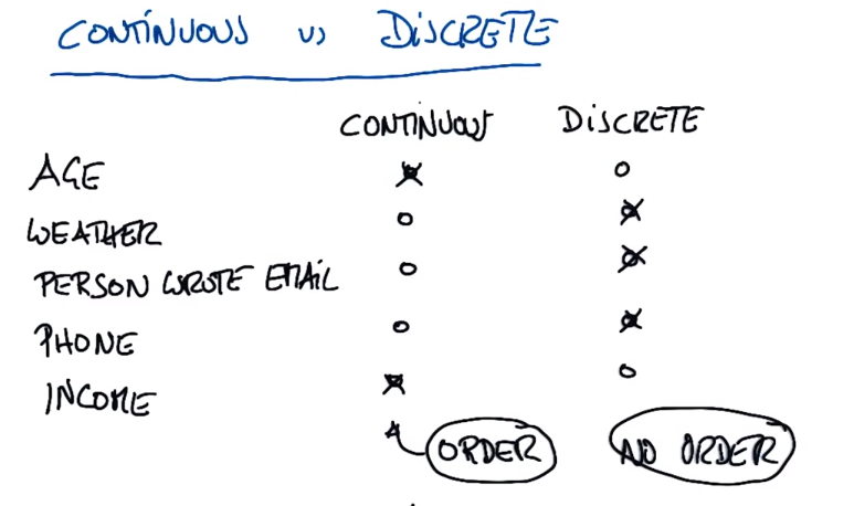
连续通常是有序的(如年龄,收入(10000和9999是没差的))
离散通常是无序的(如入职id(两个人之间不存在任何关系)、天气(晴天或雨天)、根据姓名查找电话号码(连续号码是不存在任何关系的))
PS:视为离散的多数事物在某种程度上是连续的(如把天气表示为在某个时间段内日光投射到地面上某一地区的量,即连续的计量))
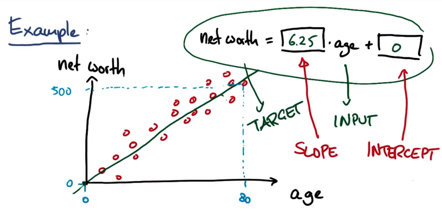
线性回归方程:
Target目标变量:尝试预测的变量,即output
Input:输入
Slope:斜率
Intercept:截距
参考网址:http://scikit-learn.org/stable/modules/linear_model.html
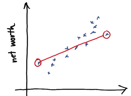
年龄/净值回归
studentMain.py
import numpy
import matplotlib
matplotlib.use('agg')
import matplotlib.pyplot as plt
from studentRegression import studentReg
from class_vis import prettyPicture, output_image
from ages_net_worths import ageNetWorthData
ages_train, ages_test, net_worths_train, net_worths_test = ageNetWorthData()
reg = studentReg(ages_train, net_worths_train)
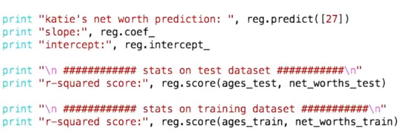
print "zwb's new worth prediction:",reg.predict([[27]])
print "slope:", reg.coef_
print "intercept:", reg.intercept_
print "r-square score:",reg.score(ages_test, net_worths_test)
print "r-square score:",reg.score(ages_train, net_worths_train)
plt.clf()
plt.scatter(ages_train, net_worths_train, color="b", label="train data")
plt.scatter(ages_test, net_worths_test, color="r", label="test data")
plt.plot(ages_test, reg.predict(ages_test), color="black")
plt.legend(loc=2)
plt.xlabel("ages")
plt.ylabel("net worths")
plt.savefig("test.png")
output_image("test.png", "png", open("test.png", "r").read())studentRegression.py
def studentReg(ages_train, net_worths_train):
	### import the sklearn regression module, create, and train your regression
	### name your regression reg

	### your code goes here!
	from sklearn import linear_model
	reg = linear_model.LinearRegression()
	reg.fit(ages_train, net_worths_train)

	return reg
ages_net_worths.py
import numpy
import random

def ageNetWorthData():
	random.seed(42)
	numpy.random.seed(42)

	ages = []
	for ii in range(100):
		ages.append( random.randint(20,65) )
	net_worths = [ii * 6.25 + numpy.random.normal(scale=40.) for ii in ages]
### need massage list into a 2d numpy array to get it to work in LinearRegression
	ages = numpy.reshape( numpy.array(ages), (len(ages), 1))
	net_worths = numpy.reshape( numpy.array(net_worths), (len(net_worths), 1))

	from sklearn.cross_validation import train_test_split
	ages_train, ages_test, net_worths_train, net_worths_test = train_test_split(ages, net_worths)

	return ages_train, ages_test, net_worths_train, net_worths_test
class_vis.py不变
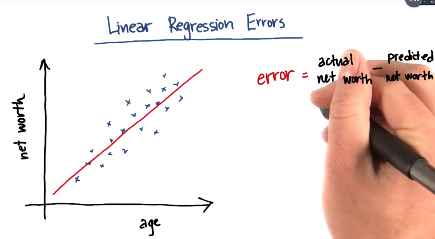
线性回归误差Linear Regression Errors
在本示例中误差表示某个人的实际净值actual net worth与回归线预测的净值predicted net worth之间的差异
QUIZ: 拟合能将哪种误差降至最低?
- □ 第一个和最后一个数据点的误差×
- □ 所有数据点的误差和×
- □ 所有误差的绝对值的和√
- □ 所有误差的平方和√
选项1:
选项2:
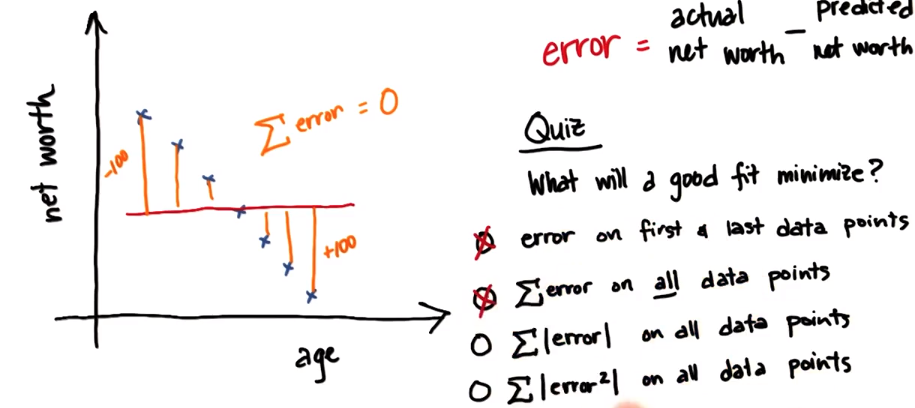
选项3:误差绝对值的和——可以找到多条能最大程度降低绝对误差的线,因此准确范围存在模糊性
选项4:只有一条可以最大程度降低误差平方的线,使用误差平方和查找回归的方法也能是回归更简单
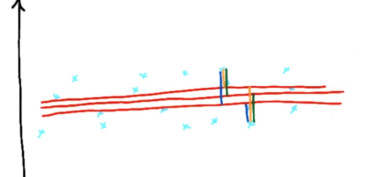
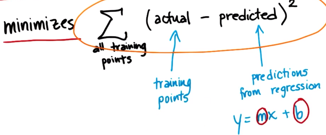
误差平方和(sum of square errors—— SSE)
最佳回归是最小化误差平方和的回归:找到使误差平方和最小的m和b
计算误差平方和最受欢迎的两种解决算法:
1.普通最小二乘法(ordinary least squares——OLS)
2.梯度下降法(gradient descent)
R平方
SSE会因为所使用的数据点的数量增加而出现偏差(增加),因此出现了另一种评估指标——R平方,可描述线性回归的拟合良好度,取值0~1(但是可能会是负数),值越大,拟合表现越好,在数据集会发生改变的情况下,R平方比SSE表现更好。
R平方的函数
score(X, y[,]sample_weight) ,返回预测的决定系数R ^ 2。定义为(1-u/v),其中u = ((y_true - y_pred)**2).sum(),而v=((y_true-y_true.mean())**2).mean(),最好的得分为1.0,一般的得分都比1.0低,得分越低代表结果越差。它可能是负数,因为模型可能会更加糟糕.当一个模型不论输入何种特征值,其总是输出期望的y的时候,此时返回0
什么数据适用于线性回归
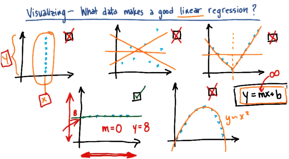
比较分类和回归:
输出类型:监督分类(类标签是离散的),回归(持续的,预测数字等)
真正查找的是:分类(决策边界——根据点相对于决策边界的位置,赋予其类标签),回归(最优拟合线——拟合数据的线条,而不是描述数据的边界)
如何评估:监督分类(查准率作为指标——在测试集上是否正确赋予类标签),回归(误差平方和——R平方)
回归迷你项目
1.从 sklearn 导入 LinearRegression 并创建/拟合回归。将其命名为 reg,这样绘图代码就能将回归覆盖在散点图上呈现出来。
提取斜率(存储在 reg.coef_ 属性中)和截距。斜率5.44814029和截距-102360.543294
2.假设没有在测试集上进行测试,而是在训练数据上进行了测试,并且用到的方法是将回归预测值与训练数据中的目标值(比如:奖金)做对比。(这里的回归预测值我一直觉得是predict(feature_test),但是好像不是....)分数是0.0455091926995,此分数不是非常好(但却非常糟糕)
3.在测试数据上计算回归的分数。-1.48499241737
4.假设你对数据做出了思考,并且推测出“long_term_incentive”特征(为公司长期的健康发展做出贡献的雇员应该得到这份奖励)可能与奖金而非工资的关系更密切。证明你的假设是正确的一种方式是根据长期激励回归奖金,然后看看回归是否显著高于根据工资回归奖金。根据长期奖励回归奖金—测试数据的分数是多少?-0.59271289995
5.
关于异常值的识别和删除。返回至之前的一个设置,你在其中使用工资预测奖金,并且重新运行代码来回顾数据。你可能注意到,少量数据点落在了主趋势之外,即某人拿到高工资(超过 1 百万美元!)却拿到相对较少的奖金。此为异常值的一个示例,
类似的这种点可以对回归造成很大的影响:如果它落在训练集内,它可能显著影响斜率/截距。如果它落在测试集内,它可能比落在测试集外要使分数低得多。就目前情况来看,此点落在测试集内(而且最终很可能降低分数)。让我们做一些处理,看看它落在训练集内会发生什么。在 finance_regression.py 底部附近并且在 plt.xlabel(features_list[1]) 之前添加这两行代码:
reg.fit(feature_test, target_test)
plt.plot(feature_train, reg.predict(feature_train), color="b")
现在,我们将绘制两条回归线,一条在测试数据上拟合(有异常值),一条在训练数据上拟合(无异常值)。来看看现在的图形,有很大差别,对吧?单一的异常值会引起很大的差异。
新的回归线斜率是多少?2.27410114
#!/usr/bin/python
# -*- coding: utf-8 -*-
"""
    Starter code for the regression mini-project.

    Loads up/formats a modified version of the dataset
    (why modified?  we've removed some trouble points
    that you'll find yourself in the outliers mini-project).

    Draws a little scatterplot of the training/testing data

    You fill in the regression code where indicated:
"""


import sys
import pickle
sys.path.append("../tools/")
from feature_format import featureFormat, targetFeatureSplit
dictionary = pickle.load( open("../final_project/final_project_dataset_modified.pkl", "r") )

### list the features you want to look at--first item in the
### list will be the "target" feature
#salary 和 bonus 的关系
features_list = ["bonus", "salary"]
#long_term_incentive 和 bonus 的关系
#features_list = ["bonus", "long_term_incentive"]

data = featureFormat( dictionary, features_list, remove_any_zeroes=True,sort_keys = '../tools/python2_lesson06_keys.pkl')
target, features = targetFeatureSplit( data )

### training-testing split needed in regression, just like classification
from sklearn.cross_validation import train_test_split
feature_train, feature_test, target_train, target_test = train_test_split(features, target, test_size=0.5, random_state=42)
train_color = "b"
test_color = "r"


### Your regression goes here!
### Please name it reg, so that the plotting code below picks it up and
### plots it correctly. Don't forget to change the test_color above from "b" to
### "r" to differentiate training points from test points.
#训练模型
from sklearn import linear_model
reg = linear_model.LinearRegression()
reg.fit(feature_train,target_train)

#提取斜率和截距
print "slope:", reg.coef_
print "intercept:", reg.intercept_
#在训练数据上计算回归分数
print "r-square score:",reg.score(feature_train,target_train)
#在测试数据上计算回归分数
print "r-square score:",reg.score(feature_test,target_test)


### draw the scatterplot, with color-coded training and testing points
import matplotlib.pyplot as plt
for feature, target in zip(feature_test, target_test):
    plt.scatter( feature, target, color=test_color )
for feature, target in zip(feature_train, target_train):
    plt.scatter( feature, target, color=train_color )

### labels for the legend
plt.scatter(feature_test[0], target_test[0], color=test_color, label="test")
plt.scatter(feature_test[0], target_test[0], color=train_color, label="train")


### draw the regression line, once it's coded
try:
    plt.plot( feature_test, reg.predict(feature_test) )
except NameError:
    pass
#去除异常值后的斜率和回归线
reg.fit(feature_test, target_test)
print "slope:", reg.coef_
plt.plot(feature_train, reg.predict(feature_train), color="g")

plt.xlabel(features_list[1])
plt.ylabel(features_list[0])
plt.legend()
plt.show()