Coursera: Applied Plotting, Charting & Data Representation in Python Week 1
第一周主要讲的是Data Visualization的基本原则。
主要是用视频和文献的形式讨论:什么样的图表是好的科学的图表?
标题名称以视频名称命名
Tools for Thinking about Design (Alberto Cairo)
这段视频介绍了一个多维度分析图表设计的工具 课程提供了一个使用Visualization Wheel Dimensions进行维度分析的小工具。
这个工具的名称为 Visualization Wheel Dimensions,发明者是Alberto Cairo。主要有以下6个维度对:
- Abstraction vs Figuration
Boxes and charts (abstraction) or real-world physical objects (figuration) - Functionality vs Decoration
No embellishments (functionality) or artistic embellishment (decoration) - Density vs Lightness
Must be studied in depth (density) or understandable at a glance (lightness)
An example from the lecturer:
One scatter chart and two bar charts. A dense figure. - Multidimensional vs Unidimensional
Different aspects of phenomena (multidimensional) or single or fewer items of phenomena (unidimenstional) - Originality vs Familiarity
Novel methods of visualization (originality) or established and well understood methods of visualization (familiarity) - Novelty vs Redundancy
Explaining each item once (novelty) or encoding multiple explanations of the same phenomena (redundancy)
The first is more preferred by the scientists and engineers and the second graphic designers and journalists
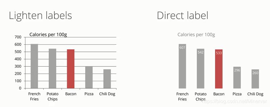
Graphical Heuristics: Data-ink ratio (Edward Tufte)
Remove to improve the data-ink ratio (最大化墨水比):删去没有意义和重复的图标元素用最少的墨水呈现最多的内容。
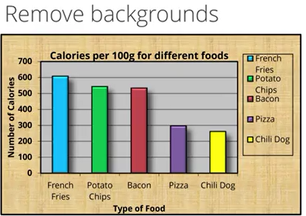
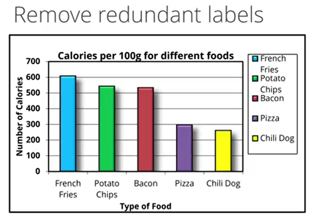
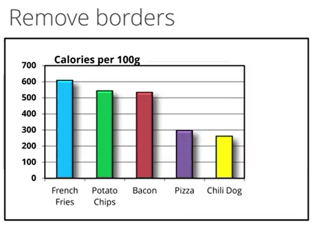
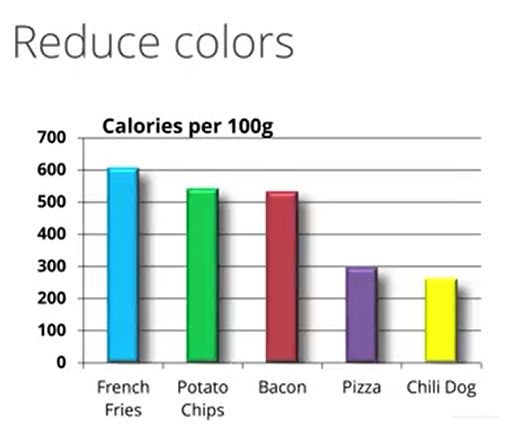
在这个视频中老师这里举了一个例子,这个例子描述如何逐步地删去无效墨水。
- 首先无效背景
- 其次是冗杂的图例。X轴处的标签已经反应了对应的食物(也说明颜色是多余的。)
- 边框也费墨水。
- 颜色没有增加更多的信息。
- 这里条形图的效果也是无用的信息。(颜色也可以起到强调的作用,所以保留了Bacon的颜色)
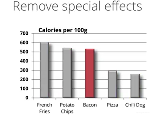
- Grids也是无效的,可能会分散注意力。
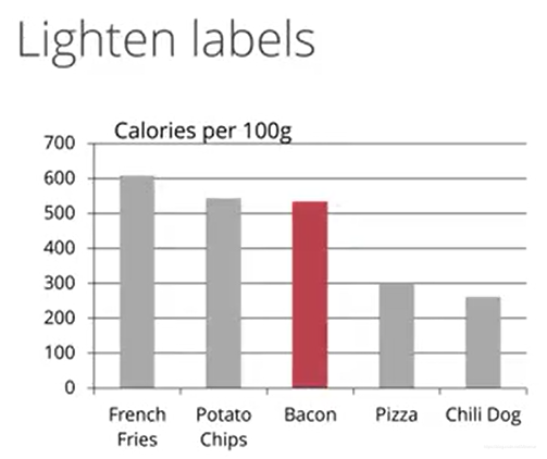
- 换成直接的数据标记。节省了grid的墨水,呈现出来更多的信息。
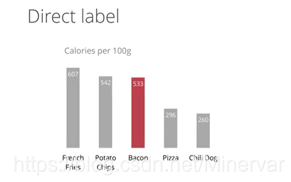
最后,把前后的图标效果进行对比。
对比左图,右图就很清晰明朗了。
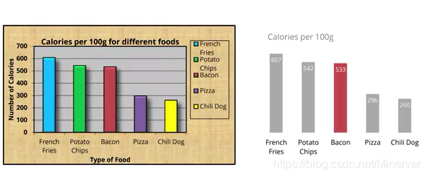
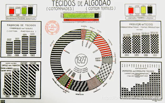
Chart junk (Edward Tufte)
Artistic decorations on statistical graphs are like weeds in our data graphics.
3 kinds
-
Unintended optical art
including excessive shading, patterning of chart features
-
Grid
Unnecessary data ink and causes the competition with the actual data being shared for viewers’ attention.
Thinning, removing, desaturating grid lines/directing labeling -
“Duck”
There are debates on the issue…
Duck causes the chart junk but the memorable features.
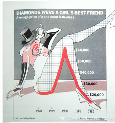
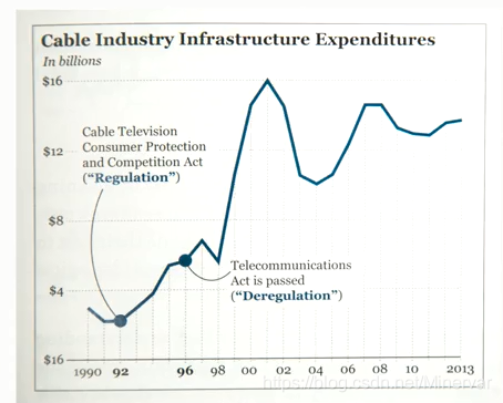
Graphics heuristics: Lie Factor and Spark Lines (Edward Tufte)
pricinple : Simplicity and minimalism
- Simple spark lines speak much.
- Lie factor = size of the effect shown in the graphic/ size of effect actuality in the data.
An example:
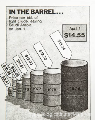
不清楚这里的barrel的大小是干什么用的:价格、实际大小还是因为远近
The Truthful Art (Alberto Cairo)
Five qualities of figures interdependent.
- Truthful
Be aware of your actions when cleaning, summarizing and manipulating data and ensure you are not:
Misleading yourself
Misleading your audience.
An example:
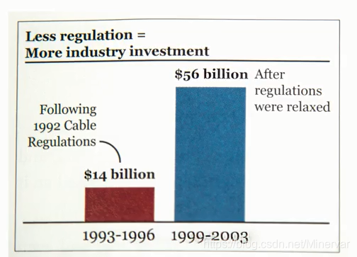
Problem:- Money inflation adjustment
- Unbalanced time span. 3 years agains 4 years
After revision,
No absolute truth but more truthful ways than others. 得不出那样的之前结论。
- Functional
Direct labeling to add functionality previous examples…
- Beautiful
Depends on the audience… - Insightful
- Enlightening : A combination of the previous four, but with a social ethical responsibility.
Assigment 1
作业要求阅读一篇Cairo 2015 (Graphics Lies, Misleading Visuals)文献并找一个网上欺骗性图表的例子进行简单分析。这个话题知乎上也有类似的讨论。
参考了一篇网上的文献,稍微写了一下。
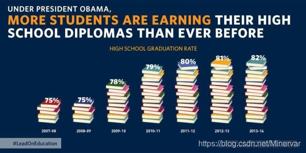
The figure was from a tweet of White House and the target audience were the general public. The figure lied for the growth in the past year. Generally people would think the floor level starts at zero. But it is not the story in the figure. With the 0 floor sub consciousness, the growth is exaggerated by the figure. 78% looks two times high as 75%. It is a trick made by the truncated Y axis.