文章目录
一、Matplotlib基础
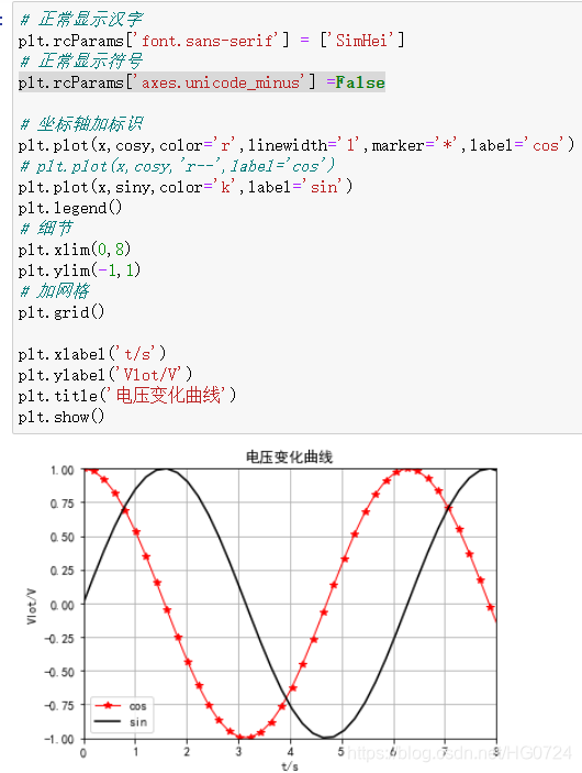
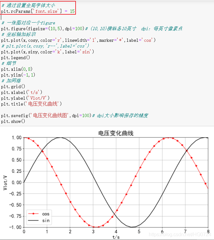
1.1 基本参数
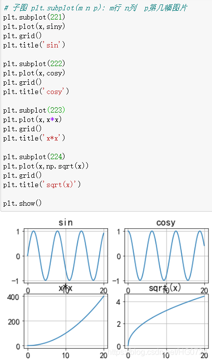
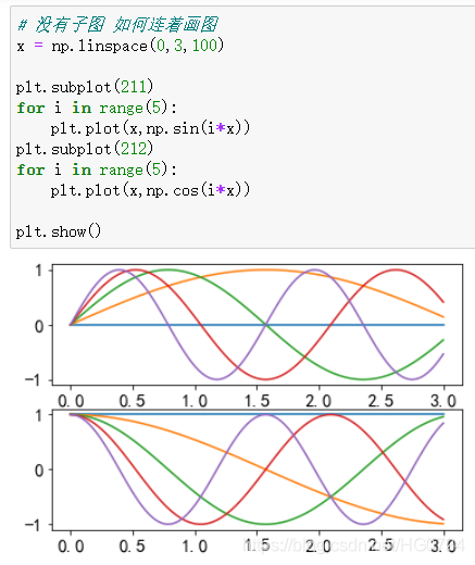
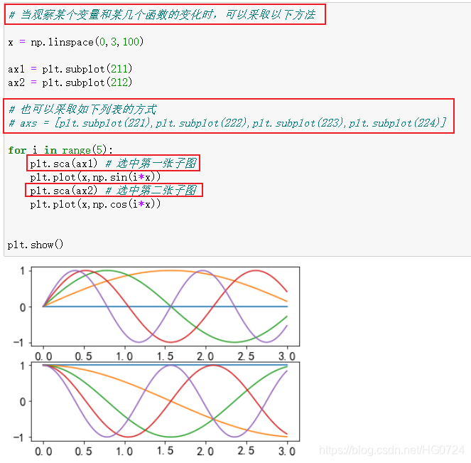
1.2 子图subplot
- 字体设置
局部:参数font_size
全局:plt.rcParams[‘font.size’] = 15
- 实例
代码如下(示例):
import numpy as np
import pandas as pd
import matplotlib.pyplot as plt
import seaborn as sns
import warnings
warnings.filterwarnings('ignore')
import  ssl
ssl._create_default_https_context = ssl._create_unverified_context
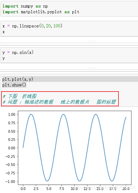
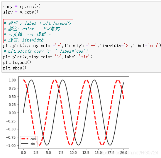
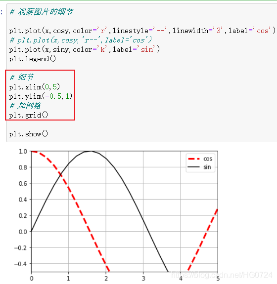
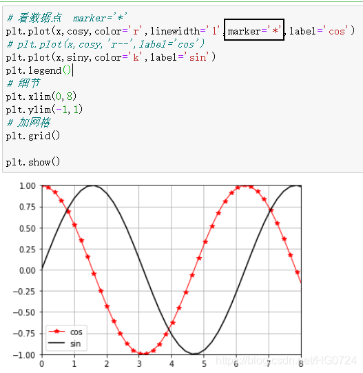
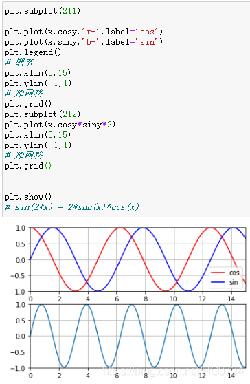
- 验证 sin(2x) = 2sin(x)*cos(x)
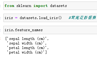
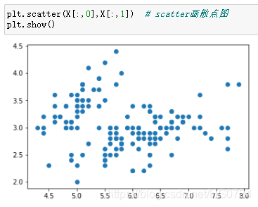
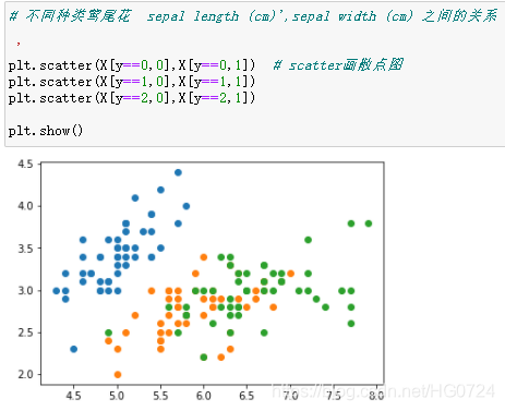
1.3 实例展示-散点图scatter
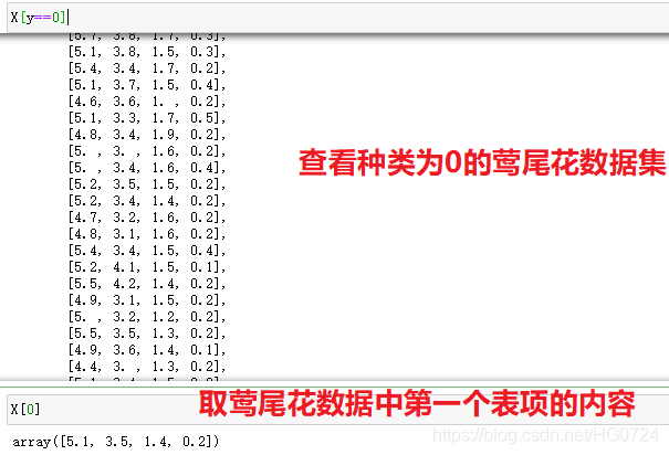
- 使用莺尾花数据集
二、常见图形绘制
折线图 plot 观察一个变量的变化趋势
散点图 scatter 分析两个量之间的关系
柱状图 bar 管擦和或者对比不同变量的不同之处
饼 图 pie 分析一个整体里面的各个部分所占比列关系
面积图 stackplot 观察几个量之间和总量的变化趋势
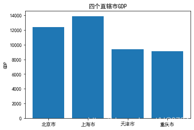
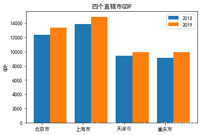
- 柱状图
import matplotlib.pyplot as plt
import numpy as np
plt.rcParams['font.sans-serif'] = ['SimHei'] #汉字显示
plt.rcParams['axes.unicode_minus'] =False  # 正负号问题

cities = ['北京市','上海市','天津市','重庆市']
GDP2018 = np.array([12400,13900,9386,9143])

plt.bar(range(4),GDP2018)
plt.title('四个直辖市GDP')

#改变横坐标标识的值   --->实际上是给横坐标轴加上标识
plt.xticks(range(4),cities)
plt.ylabel('GDP')
plt.show()
plt.barh(range(4),GDP2018)
plt.title('四个直辖市GDP')
plt.yticks(range(4),cities)
plt.xlabel('GDP')
plt.show()

GDP2019 = np.array([13400,14900,9886,9943])

# 如何添加新数据到柱状图  直接添加bar会覆盖旧数据

H=0.4  #控制高度

plt.barh(np.arange(4),GDP2018,height= H)
plt.barh(np.arange(4)+H,GDP2019,height= H)
plt.title('四个直辖市GDP')
plt.yticks(range(4),cities)
plt.xlabel('GDP')
plt.show()

W = 0.4 # 控制宽度

plt.bar(np.arange(4),GDP2018,width=W,label='2018')
plt.bar(np.arange(4)+W,GDP2019,width=W,label='2019')
plt.title('四个直辖市GDP')

#改变横坐标标识的值   --->实际上是给横坐标轴加上标识
plt.xticks(range(4),cities)
plt.ylabel('GDP')
plt.legend()  # 加上颜色标识
plt.show()
- 直方图
x = np.random.normal(70,10,size=1000) #均值70 标准差10
# bins如下图是10个方块
bins = np.arange(30,100,10)
plt.hist(x,bins=bins,density = True)  # 则y轴是面积出现的概率
plt.show()

#  二维直方图
x = np.random.randn(1000)
y = np.random.randn(1000)

plt.hist2d(x,y,bins=20)
plt.show()

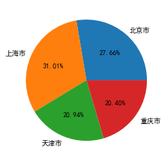
- 饼图
#主要用来展示一个整体中各个部分所占比例

plt.pie(GDP2018,labels=cities,autopct='%1.2f%%')
plt.show()
- 面积图
data = ['2020-01','2020-02','2020-03','2020-04']
eat = [10,20,10,40]
drink = [20,40,30,20]
play = [20,20,50,40]

plt.stackplot(data,eat,drink,play,colors=['red','yellow','blue'])
plt.plot([],[],'r',label = '吃')
plt.plot([],[],'y',label = '喝')
plt.plot([],[],'b',label = '玩')
plt.legend()
plt.show()

三、动画和三维图形绘制
动画不能在Jupyter里面去执行,故只能写成程序文件在命令行执行。
3.1 函数画线动画
import numpy as np
import matplotlib.pyplot as plt
import matplotlib.animation as animation

fig,ax = plt.subplots()
xdata,ydata = [],[]
line, = plt.plot([],[],'ro')

def init():
    ax.set_xlim(-np.pi,np.pi)
    ax.set_ylim(-1,1)
    return line,

def update(frame):
    xdata.append(frame)
    ydata.append(np.sin(frame))
    line.set_data(xdata,ydata)
    return line,

anim = animation.FuncAnimation(fig,update,frames = np.linspace(-np.pi,np.pi,90),interval=100,
                    init_func = init,blit=True)

plt.show()
效果展示:

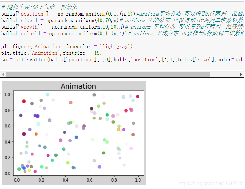
3.2 随机泡泡动画
import numpy as np
import matplotlib.pyplot as plt
import matplotlib.animation as animation
'''
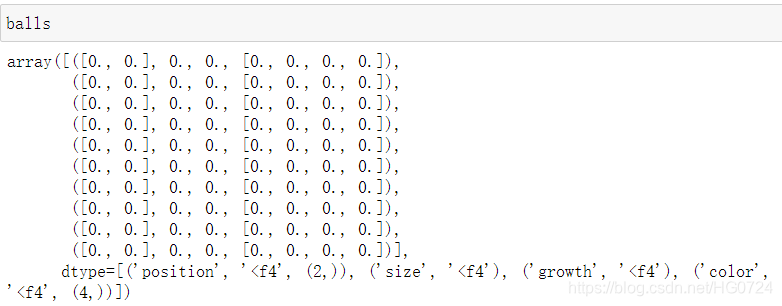
1. 随机生成100个气泡
2. 每个气泡包含4个属性:position size growth color
3. 绘制气泡
4. 编写动画,让气泡不断变大
'''
n = 100
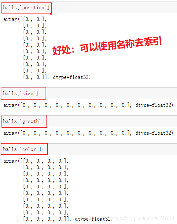
balls = np.zeros(n,dtype=[
('position','float32',2),
('size','float32',1),
('growth','float32',1),
('color','float32',4)
])
# 随机生成100个气泡,初始化
balls['position'] = np.random.uniform(0,1,(n,2))#uniform平均分布 可以得到n行两列二维数组
balls['size'] = np.random.uniform(40,70,n)# uniform 平均分布 可以得到n行两列二维数组数组
balls['growth'] = np.random.uniform(10,20,n)# uniform 平均分布 可以得到n行两列二维数组数组
balls['color'] = np.random.uniform(0,1,(n,4))# uniform 平均分布 可以得到n行两列二维数组数组
plt.figure('Animation',facecolor = 'lightgray')
plt.title('Animation',fontsize = 18)
sc = plt.scatter(balls['position'][:,0],balls['position'][:,1],balls['size'],color=balls['color'])
# 每一帧
def update(number):
balls['size'] += balls['growth']
# 每一次都选中一个泡泡重新随机属性
index = number % n
balls[index]['size'] = np.random.uniform(40,70,1)
balls[index]['position'] = np.random.uniform(0,1,(1,2))
# 重新绘制所有点
sc.set_sizes(balls['size'])
sc.set_offsets(balls['position'])
anim = animation.FuncAnimation(plt.gcf(),update,interval=2)
anim.save('paopao.gif')
plt.show()
效果展示:

-
- 代码分析
n = 100
balls = np.zeros(n,dtype=[
    ('position','float32',2),
    ('size','float32',1),
    ('growth','float32',1),
    ('color','float32',4)
])
# clolor : rgb 透明度
- 泡泡
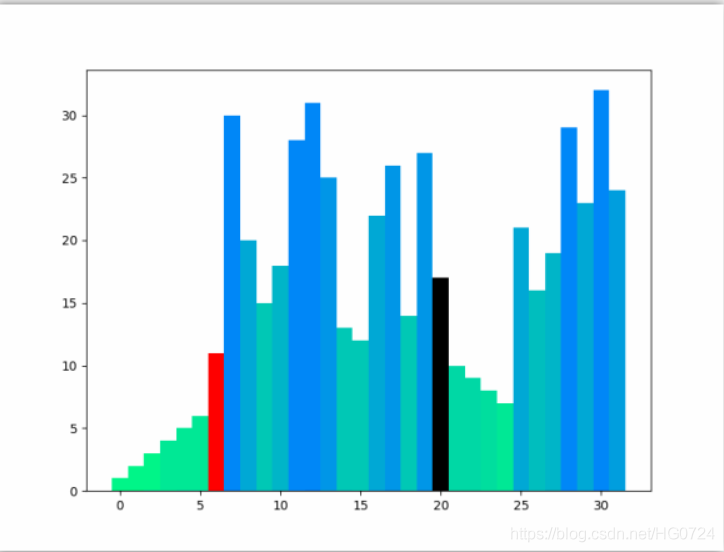
3.3 选择排序动画
import random
import copy
import numpy as np
import matplotlib.pyplot as plt
import matplotlib.animation as animation

class Data:
    # Total of data to sort
    data_count = 32 # 类变量

    def __init__(self,value):
        # 成员变量
        self.value = value # 值 :柱状图高度
        self.set_color()   # 值 :颜色

    # rgba : 4个值  红绿蓝透明度
    def set_color(self,rgba = None):
        if not rgba:
            rgba = (0,
                    1 - self.value / (self.data_count * 2),
                    self.value / (self.data_count * 2) + 0.5,
                    1)
        self.color = rgba

# 选择排序
def selection_sort(data_set):
    # FRAME OPERATION BEGIN
    frames = [data_set]
    # FRAMW OPERATION END
    #深复制 还有copy.copy()潜复制
    #整个复制给ds
    ds = copy.deepcopy(data_set)
    # ---------  经典选择排序 -----------
    for i in range(0,Data.data_count-1):
        for j in range(i+1,Data.data_count):
            # FRAME OPERATION BEGIN
            ds_r = copy.deepcopy(ds)
            ds_r[i].set_color('r')
            ds_r[j].set_color('k')
            frames.append(ds_r)
            # FRAME OPERATION END
            if ds[j].value < ds[i].value:
                ds[i],ds[j] = ds[j],ds[i]
    # ---------              --------------
    # FRAME OPERATION BEGIN
    frames.append(ds)
    return frames
    # FRAME OPERATION END

# 生成随机数
data = list(range(1,Data.data_count + 1)) #range(1,33) 生成1-32的随机数
random.shuffle(data) # 打乱顺序

# 每个数用Data这个类创建一个对象
# 列表data_set 每个元素都是Data对象
data_set = [Data(d) for d in data]

# 画动画
fig = plt.figure(1,figsize = (8,6))# (8,6)英寸
frames = selection_sort(data_set)

# 每一帧画一张
def animate(fi):# fi:第几帧
    ax = plt.gca() #拿到子图对象
    ax.cla() # 当前图清除
    bar = ax.bar(list(range(Data.data_count)),      # x
                    [d.value for d in frames[fi]],  # data
                    1,                              # width
                    color = [d.color for d in frames[fi]] # color
                    )
    return bar

anim = animation.FuncAnimation(fig,animate,frames=len(frames),interval = 10)
anim.save('selectsort.gif')
plt.show()
效果展示:
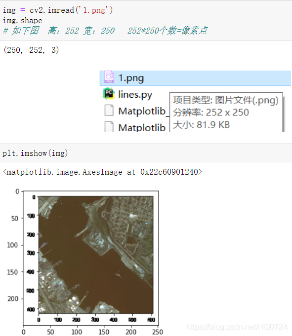
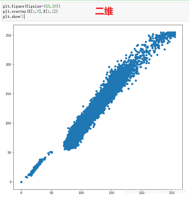
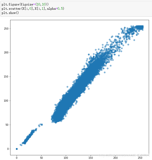
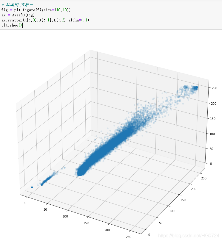
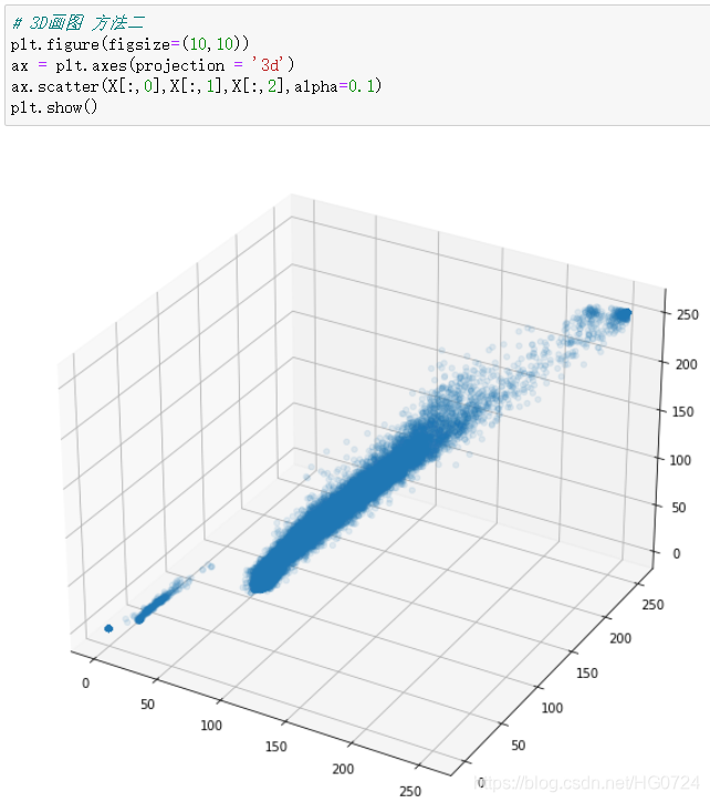
四、三维绘图案例
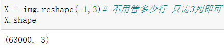
遥感图像的一个像素三个颜色值进行三维散点图显示可视化
一个像素点:包含三个颜色,RGB(Red,Green,Blue)
将Red,Green,Blue看作X,Y,Z轴,则可以在三维颜色空间中观察十如何铺开的
- 引入模块
import cv2
import matplotlib.pyplot as plt
from mpl_toolkits.mplot3d import Axes3D #3D显示模块
五、高级绘图seaborn与案例分析
结合下章Pandas讲解
总结
Matplotlib默认是不支持汉字显示问题:
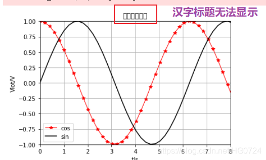
解决:plt.rcParams[‘font.sans-serif’] = [‘SimHei’]
一开始执行一次即可
Matplotlib正负号显示问题:
解决:plt.rcParams[‘axes.unicode_minus’] =False
一开始执行一次即可