在前面的案例中,电商App的环境搭建、准备工作、网络请求、登录等功能都已讲完,接下来将开始App首页的开发。
在HarmonyOS NEXT开发中,首页组成模块相对较多,需要使用到组件开发,这样开发者可以将应用中独立的业务模块抽取出来,单独创建一个模块。通过组件化,使得每个独立的业务模块都可以运行、降低开发成本和维护难度,从而大大提高开发效率。
一、基础架构
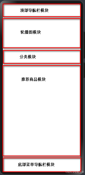
下面,我们将首页分为顶部导航栏模块、轮翻图模块、分类导航模块、推荐商品区模块,以及底部导航栏模块等五个组件。如下图:
首先,以弹性方式布局页面子组件的Flex容器组件,以垂直方向排列,水平居中方式显示子组件。代码如下:
@Entry
@Component
struct Index {

  build() {
    RelativeContainer() {
      Flex({ direction: FlexDirection.Column, alignItems: ItemAlign.Center }){
        // do something...

      }.width('100%')
       .height('100%')
    }
    .height('100%')
    .width('100%')
  }
}
Felx容器参数说明:
| 名称 | 类型 | 必填 | 说明 |
|---|---|---|---|
| direction | FlexDirection | 否 | 子组件在Flex容器上排列的方向,即主轴的方向。 默认值: FlexDirection.Row 卡片能力: 从API version 9开始,该接口支持在ArkTS卡片中使用。 |
| wrap | FlexWrap | 否 | Flex容器是单行/列还是多行/列排列。 默认值: FlexWrap.NoWrap 说明: 在多行布局时,通过交叉轴方向,确认新行堆叠方向。 卡片能力: 从API version 9开始,该接口支持在ArkTS卡片中使用。 |
| justifyContent | FlexAlign | 否 | 所有子组件在Flex容器主轴上的对齐格式。 默认值: FlexAlign.Start 卡片能力: 从API version 9开始,该接口支持在ArkTS卡片中使用。 |
| alignItems | ItemAlign | 否 | 所有子组件在Flex容器交叉轴上的对齐格式。 默认值: ItemAlign.Start 卡片能力: 从API version 9开始,该接口支持在ArkTS卡片中使用。 |
| alignContent | FlexAlign | 否 | 交叉轴中有额外的空间时,多行内容的对齐方式。仅在wrap为Wrap或WrapReverse下生效。 默认值: FlexAlign.Start 卡片能力: 从API version 9开始,该接口支持在ArkTS卡片中使用。 |
| space12+ | FlexSpaceOptions12+ | 否 | 所有子组件在Flex容器主轴或交叉轴的space。 默认值: {main:LengthMetrics.px(0), cross:LengthMetrics.px(0)} space为负数、百分比或者justifyContent设置为FlexAlign.SpaceBetween、FlexAlign.SpaceAround、FlexAlign.SpaceEvenly时不生效。 元服务API: 从API version 12开始,该接口支持在元服务中使用。 |
二、顶部导航栏
顶部导航栏通常位于App界面的顶部,为用户提供应用核心入口,如搜索框、分类按钮、个人中心等等,以及当前页面标题或标识。这里,我们将在顶部导航栏左侧添加App的logo,右侧添加搜索框功能。
在components目录中创建Header.ets文件,用于定义顶部导航组件,地址为src/main/ets/components/Header.ets。然后在首页中,引用顶部导航组件,首页示例代码如下:
import Header from '../components/Header';

@Entry
@Component
struct Index {

  build() {
    RelativeContainer() {
      Flex({ direction: FlexDirection.Column, alignItems: ItemAlign.Center }){
        // 引入顶部导航栏组件
        Header()

      }.width('100%')
       .height('100%')
    }
    .height('100%')
    .width('100%')
  }
}
2.1 Row()容器
使用Row()容器,将子元素设置为左右对齐显示。示例代码如下:
@Component
export default struct Header {
  build() {
    Row(){
      Text('Header')
      Text('Search')
    }.width('100%')
     .padding({ left: 20, right: 20, top: 10, bottom: 10 })
     .justifyContent(FlexAlign.SpaceBetween)
  }
}
效果如下图:

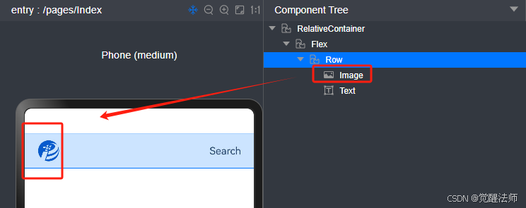
2.2 Logo
使用Image()组件,定义App的Logo,示例代码如下:
@Component
export default struct Header {
  build() {
    Row(){
      Image($rawfile('logo.png'))
        .width(35)
      Text('Search')
    }.width('100%')
     .padding({ left: 20, right: 20, top: 10, bottom: 10 })
     .justifyContent(FlexAlign.SpaceBetween)
  }
}
页面效果如下图:
2.3 搜索图标
在顶部导航栏右侧,添加图标+文字方式 的搜索标识,当用户点击时切换输入框进行搜索。示例代码如下:
@Component
export default struct Header {
  build() {
    Row(){
      Image($rawfile('logo.png'))
        .width(35)

      Row(){
        Image($rawfile('search.png'))
          .width(26)
          .margin({ right: 5 })
        Text('搜索')
          .fontSize(18)
      }
    }.width('100%')
     .padding({ left: 20, right: 20, top: 10, bottom: 10 })
     .justifyContent(FlexAlign.SpaceBetween)
  }
}
页面效果如下图:

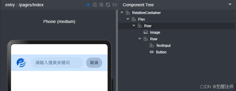
2.4 搜索框
在Header组件中,定义isSearch状态变量用于记录当前是否切换为搜索框状态,以及keyword状态变量用于记录输入框输入的内容文本。
先将isSearch赋值为true,显示搜索框状态下样式效果。示例代码如下:
@Component
export default struct Header {
  @State isSearch: boolean = true // 标识是否切换 显示搜索框,默认为false
  @State keyword: string = ''     // 搜索关键词

  build() {
    Row(){
      Image($rawfile('logo.png'))
        .width(35)
      // 如果为false,显示为图标 + 文字
      if (!this.isSearch) {
        Row(){
          Image($rawfile('search.png'))
            .width(26)
            .margin({ right: 5 })
          Text('搜索')
            .fontSize(18)
        }
      }
      // 如果为true,显示搜索框
      else {
        Row(){
          // 绘制搜索框
          TextInput({ text: this.keyword, placeholder: '请输入搜索关键词' })
            .height(40)
            .layoutWeight(1)  // 输入框获取剩于宽度作为自己宽度显示
          // 绘制取消按钮
          Button('取消').height(38)
            .backgroundColor('#CCCCCC')
            .fontColor('#333333')
            .fontSize(15)
            .fontWeight(0)
            .padding({ top: 0, bottom: 0, left: 15, right: 15 })
            .margin({ left: 10 })
        }.padding({ left: 20 })
         .layoutWeight(1)  // Row()容器获取剩于宽度作为自己宽度显示
      }

    }.width('100%')
     .padding({ left: 20, right: 20, top: 10, bottom: 10 })
     .justifyContent(FlexAlign.SpaceBetween)
  }
}
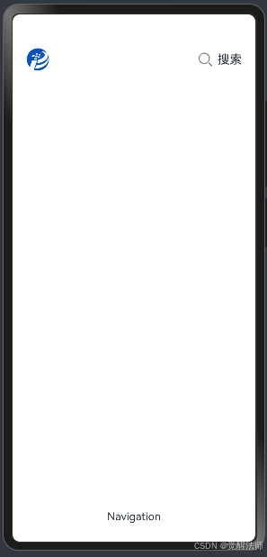
页面效果如下图:
2.5 状态切换
这里先将搜索框的显示与隐藏功能完成,待商品信息完善后,再来实现搜索功能。header.ets文件的示例代码如下:
@Component
export default struct Header {
  @State isSearch: boolean = false // 标识是否切换 显示搜索框,默认为false
  @State keyword: string = ''     // 搜索关键词

  build() {
    Row(){
      Image($rawfile('logo.png'))
        .width(35)
      // 如果为false,显示为图标 + 文字
      if (!this.isSearch) {
        Row(){
          Image($rawfile('search.png'))
            .width(26)
            .margin({ right: 5 })
          Text('搜索')
            .fontSize(18)
        }.onClick(() => {
          this.isSearch = true  // 置为true,显示搜索框
        })
      }
      // 如果为true,显示搜索框
      else {
        Row(){
          // 绘制搜索框
          TextInput({ text: this.keyword, placeholder: '请输入搜索关键词' })
            .height(40)
            .layoutWeight(1)  // 输入框获取剩于宽度作为自己宽度显示
          // 绘制取消按钮
          Button('取消').height(38)
            .backgroundColor('#CCCCCC')
            .fontColor('#333333')
            .fontSize(15)
            .fontWeight(0)
            .padding({ top: 0, bottom: 0, left: 15, right: 15 })
            .margin({ left: 10 })
            .onClick(() => {
              this.isSearch = false // 置为false,关闭搜索框
            })
        }.padding({ left: 20 })
         .layoutWeight(1)  // Row()容器获取剩于宽度作为自己宽度显示
      }

    }.width('100%')
     .padding({ left: 20, right: 20, top: 10, bottom: 10 })
     .justifyContent(FlexAlign.SpaceBetween)
  }
}
页面效果如下:

三、底部导航栏
底部导航栏位于App界面的最底部,为用户提供核心功能的快速入口,通常以图标+文字形式组成,如首页、分类、购买车、个人中心等。
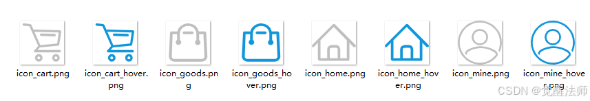
在绘制底部导航栏前,先准备好以下几个图标。如下图:
3.1 定位底部
底部导航栏,顾名思义是要固定在页面的底部。传统web页面、App或小程序是通过定位方式,将导航底部在底部或顶部;在HarmonyOS NEXT中,可以使用layoutWeight()权重,将flex容器中剩余高度,分配给指定容器。
打开Index.ets 首页文件,示例代码如下:
import Header from '../components/Header';
import Navi from '../components/Navigation';

@Entry
@Component
struct Index {

  build() {
    RelativeContainer() {
      Flex({ direction: FlexDirection.Column, alignItems: ItemAlign.Center }){
        Header()    // 顶部导航组件

        Row(){
          // 将屏幕中 剩余调度,设置为中间内容区域的调度
          // 这样可以使用Header和Navi组件,分别固定在页面的顶部和底部
        }.layoutWeight(1)

        Navi()    // 底部菜单栏组件

      }.width('100%')
       .height('100%')
    }
    .height('100%')
    .width('100%')
  }
}
此时,Navigation底部菜单栏则显示在页面的最底部,如下图:
3.2 定义菜单数据
在底部菜单组件中,定义好菜单列表数据,将通过foreach循环渲染出来。示例代码如下:
// 定义数据类型
interface navInfo {
  id: number
  name: string
  icon: Resource,
  iconHover: Resource
  path?: string
}

@Component
export default struct CustomNavigation {
  private NavList: Array<navInfo> = [
    {id: 1, name: '首页', icon: $rawfile('icon_home.png'), iconHover: $rawfile('icon_home_hover.png')},
    {id: 2, name: '商品', icon: $rawfile('icon_goods.png'), iconHover: $rawfile('icon_goods_hover.png')},
    {id: 3, name: '购买车', icon: $rawfile('icon_cart.png'), iconHover: $rawfile('icon_cart_hover.png')},
    {id: 4, name: '我的', icon: $rawfile('icon_mine.png'), iconHover: $rawfile('icon_mine_hover.png')}
  ]

  build() {
    Row(){
      Text('Navigation')
    }
  }
}
3.3 Row()容器
在Row()容器中,通过justifyContent()方法,将横向布局设置为FlexAlign.SpaceAround,将首页、商品、购物车、我的四个菜单四等分显示。并且,通过ForEach()方法,循环输出菜单列表信息。示例代码如下:
// 定义数据类型
interface navInfo {
  id: number
  name: string
  icon: Resource,
  iconHover: Resource
  path?: string
}

@Component
export default struct CustomNavigation {
  private NavList: Array<navInfo> = [
    {id: 1, name: '首页', icon: $rawfile('icon_home.png'), iconHover: $rawfile('icon_home_hover.png')},
    {id: 2, name: '商品', icon: $rawfile('icon_goods.png'), iconHover: $rawfile('icon_goods_hover.png')},
    {id: 3, name: '购买车', icon: $rawfile('icon_cart.png'), iconHover: $rawfile('icon_cart_hover.png')},
    {id: 4, name: '我的', icon: $rawfile('icon_mine.png'), iconHover: $rawfile('icon_mine_hover.png')}
  ]

  build() {
    Row(){
      // 循环输入
      ForEach(this.NavList, (item: navInfo) => {
        Column(){
          Image(item.icon).width(30)  // 图标
          // 标题名称
          Text(item.name)
            .fontSize(14)
            .fontColor('#333333')
        }
      })
    }.width('100%')
     .justifyContent(FlexAlign.SpaceAround)
  }
}
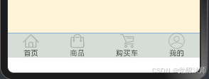
页面效果如下图:
3.4 菜单高亮
在底部菜单导航组件中,定义NavIndex变量,用于记录当前菜单项索引。等于当前索引时,显示高亮图标和文字。示例代码如下:
// 定义数据类型
interface navInfo {
  id: number
  name: string
  icon: Resource,
  iconHover: Resource
  path?: string
}

@Component
export default struct CustomNavigation {
  private NavList: Array<navInfo> = [
    {id: 1, name: '首页', icon: $rawfile('icon_home.png'), iconHover: $rawfile('icon_home_hover.png')},
    {id: 2, name: '商品', icon: $rawfile('icon_goods.png'), iconHover: $rawfile('icon_goods_hover.png')},
    {id: 3, name: '购买车', icon: $rawfile('icon_cart.png'), iconHover: $rawfile('icon_cart_hover.png')},
    {id: 4, name: '我的', icon: $rawfile('icon_mine.png'), iconHover: $rawfile('icon_mine_hover.png')}
  ]
  @State NavId: number = 0  // 当前项ID,默认第一项高亮

  build() {
    Row(){
      // 循环输入
      ForEach(this.NavList, (item: navInfo) => {
        Column(){
          Image(this.NavId == item.id ? item.iconHover : item.icon).width(30)  // 图标
          // 标题名称
          Text(item.name)
            .fontSize(14)
            .fontColor(this.NavId == item.id ? '#333333' : '#666666')
        }
      })
    }.width('100%')
     .justifyContent(FlexAlign.SpaceAround)
  }
}
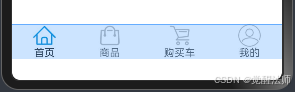
页面效果如下图:
3.5 页面跳转
如下图,在项目中先创建首页 和 个人中心两个空页面,用于页面跳转。
在底部菜单导航组件中,添加首页和个人中心页面路径,并在Column上添加onClick事件,用于跳转业务处理。示例代码如下:
import router from "@ohos.router"

// 定义数据类型
interface navInfo {
  id: number
  name: string
  icon: Resource,
  iconHover: Resource
  path?: string
}

@Component
export default struct CustomNavigation {
  private NavList: Array<navInfo> = [
    {
      id: 1,
      name: '首页',
      icon: $rawfile('icon_home.png'),
      iconHover: $rawfile('icon_home_hover.png'),
      path: 'pages/Index'
    },
    {id: 2, name: '商品', icon: $rawfile('icon_goods.png'), iconHover: $rawfile('icon_goods_hover.png')},
    {id: 3, name: '购买车', icon: $rawfile('icon_cart.png'), iconHover: $rawfile('icon_cart_hover.png')},
    {
      id: 4,
      name: '我的',
      icon: $rawfile('icon_mine.png'),
      iconHover: $rawfile('icon_mine_hover.png'),
      path: 'pages/Mine'
    }
  ]
  @State NavId: number = 1  // 当前项ID,默认第一项高亮

  build() {
    Row(){
      // 循环输入
      ForEach(this.NavList, (item: navInfo) => {
        Column(){
          Image(this.NavId == item.id ? item.iconHover : item.icon).width(30)  // 图标
          // 标题名称
          Text(item.name)
            .fontSize(14)
            .fontColor(this.NavId == item.id ? '#333333' : '#666666')
        }.onClick(() => {
          if (item.path) {
            router.pushUrl({ url: item.path })
          }
        })
      })
    }.width('100%')
     .justifyContent(FlexAlign.SpaceAround)
  }
}
首页代码如下:
import Header from '../components/Header';
import Navi from '../components/Navigation';

@Entry
@Component
struct Index {

  build() {
    RelativeContainer() {
      Flex({ direction: FlexDirection.Column, alignItems: ItemAlign.Center }){
        Header()

        Row(){
          // 将屏幕中 剩余调度,设置为中间内容区域的调度
          // 这样可以使用Header和Navi组件,分别固定在页面的顶部和底部
        }.layoutWeight(1)

        Navi({ NavId: 1 })

      }.width('100%')
       .height('100%')
    }
    .height('100%')
    .width('100%')
  }
}
个人中心页面代码如下:
import Navi from '../components/Navigation';

@Entry
@Component
struct Mine {
  @State message: string = 'Hello World';

  build() {
    RelativeContainer() {
      Flex({ direction: FlexDirection.Column, alignItems: ItemAlign.Center }){

        Row(){
          // 将屏幕中 剩余调度,设置为中间内容区域的调度
          // 这Navi组件,分别固定在页面的顶部和底部
        }.layoutWeight(1)
        Navi({ NavId: 4 })

      }.width('100%')
      .height('100%')
    }
    .height('100%')
    .width('100%')
  }
}
首页和个人中心的切换效果,如下图:

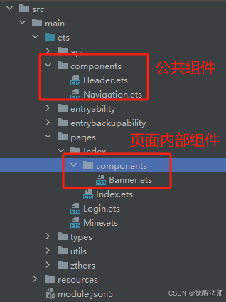
四、轮翻图
轮翻图模块通过滑动切换方式展示多张图片或广告内容,通常展示新品推荐、优惠活动或热门商品等信息。
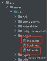
由于首页内容较多,需要将各业务模块独立抽取出来,因此将Index调整为目录形式,在内部创建components文件夹,用于单独存放首页中抽取的独立模块,方便各业务模块的维护。如下图:
注意:首页结构调整后,需要打开src/main/resources/base/profile/main_pages.json文件,查看首页路径地址是否更新,否则无法正常跳转。示例代码如下:
{
  "src": [
    "pages/Index/Index",
    "pages/Mine",
    "pages/Login"
  ]
}
4.1 调整首页结构
在首页中,引入Banner()组件,并将中间Row()容器添加alignItems和justifyContent,将容器布局调整为居上居左显示。示例代码如下:
import Header from '../../components/Header';
import Navi from '../../components/Navigation';
import Banner from './components/Banner';

@Entry
@Component
struct Index {

  build() {
    RelativeContainer() {
      Flex({ direction: FlexDirection.Column, alignItems: ItemAlign.Center }){
        Header()  // 顶部导航
        Row(){
          // 将屏幕中 剩余调度,设置为中间内容区域的调度
          // 这样可以使用Header和Navi组件,分别固定在页面的顶部和底部

          // 引入Banner图
          Banner()
        }.layoutWeight(1)
         .width('100%')
         .alignItems(VerticalAlign.Top)
         .justifyContent(FlexAlign.Start)
        // 底部菜单栏
        Navi({ NavId: 1 })

      }.width('100%')
       .height('100%')
    }
    .height('100%')
    .width('100%')
  }
}
4.2 定义Banner数据类型
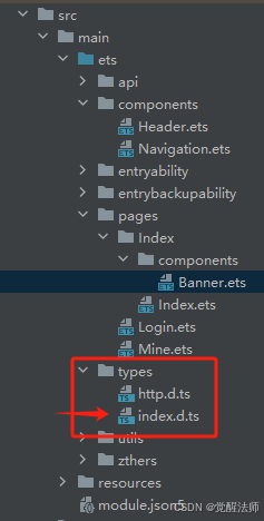
在types目录中的index.d.ts文件,定义banner的数据类型。
示例代码如下:
/**
 * 首页Banner数据结构
 */
interface HomeBanner {
  id: number
  name: string
  thumb: string
}
4.3 API请求
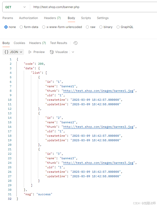
接下来,我们通过API请求,获取数据库中的Banner数据,并在界面中显示这些图片信息。
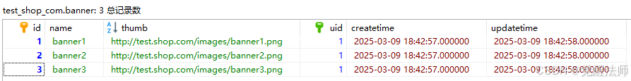
postman中查看API接口数据,如下图:
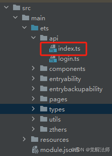
在api/index.ts中,添加获取banner数据的API接口函数。目录结构如下图:
api/index.ets中的getBannerInfo接口函数,示例代码如下:
import { standardInterfaceResult } from '../types/http'
import { httpRequest } from '../utils/request'

/**
 * 获取banner信息
 */
export const getBannerInfo = async () => {
  return await httpRequest.get<standardInterfaceResult>('/banner.php')
}
在Banner组件模块在,引入getBannerInfo函数并获取数据。当成功获取时,将数据赋值给状态变量bannerList。示例代码如下:
import { getBannerInfo } from "../../../api"

@Component
export default struct Banner {
  // 定义状态变量
  @State bannerList: Array<HomeBanner> = []

  aboutToAppear(): void {
    getBannerInfo().then(res => {
      if (res.code == 200 && Array.isArray(res.data)) {
        this.bannerList = res.data['list']
        console.log('result: ', JSON.stringify(res.data))
      }
    })
  }

  build() {
    Text('banner')
  }
}
4.4 轮翻图组件
在HarmonyOS NEXT中,Swiper组件提供滑动轮播显示的能力;Swiper本身是一个容器组件,当设置了多个子组件后,可以对这些子组件进行轮播显示。通常,在一些应用首页显示推荐的内容时,需要用到轮播显示的能力。
官方文档地址:文档中心
使用Swiper组件,完成轮播图功能,示例代码如下:
import { getBannerInfo } from "../../../api"
@Component
export default struct Banner {
// 定义状态变量
@State bannerList: Array<HomeBanner> = []
aboutToAppear(): void {
getBannerInfo().then(res => {
// 获取banner数据
if (res.code == 200 && res.data) {
this.bannerList = res.data['list']
console.log('result: ', JSON.stringify(this.bannerList))
}
}).catch(() => {
console.log('error')
})
}
build() {
Swiper(){
// 循环输出图片信息
ForEach(this.bannerList, (item: HomeBanner) => {
Image(item.thumb).borderRadius(10)
})
}
.width("100%")
.height("200vp")
.padding(10)
.index(0) // 默认索引
.autoPlay(true) // 自动播放
.loop(true) // 循环播放
.itemSpace(10) // 图片的间隙
}
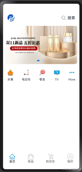
}页面效果如下图:

五、分类模块
分类导航模块可以为用户提供一个快速查询商品的方式,通常为商品的分类标签或图标组成,用户可以通过点击这些标签浏览不同类别的商品信息。
5.1 分类图标
开发分类导航模块前,先准备好以下分类图标。

5.2 Row()容器
使用Row()容器对分类信息进行横向显示,配置justifyContent()方法将分类信息进行横向平均(FlexAlign.SpaceAround)分配,配置alignItems()方法使分类信息垂直方向为水平对齐(VerticalAlign.Center)。
Categroy.ets组件示例代码如下:
/**
 * 定义分类数据结构
 */
interface categoryInfo {
  id: number
  name: string
  thumb: Resource
}

@Component
export default struct CategoryList {
  @State categoryList: Array<categoryInfo> = [
    {id: 1, name: '水果', thumb: $rawfile('category_fruit.png')},
    {id: 2, name: '电动车', thumb: $rawfile('category_car.png')},
    {id: 3, name: '零食', thumb: $rawfile('category_snack.png')},
    {id: 4, name: 'TV', thumb: $rawfile('category_tv.png')},
    {id: 5, name: 'More', thumb: $rawfile('category_more.png')}
  ]

  build() {
    Row({ space: 15 }){
      ForEach(this.categoryList, (item: categoryInfo) => {
        Column(){
          Image(item.thumb).width(30).margin({ bottom: 10 })
          Text(item.name).fontSize(14)
        }.padding({ top: 15, bottom: 15 })
      })
    }.width('100%')
     .justifyContent(FlexAlign.SpaceAround)
     .alignItems(VerticalAlign.Center)
  }
}
5.3 引入分类信息
将分类Categroy.ets组件引入首页,由于Row() 容器默认是水平方向布局的,如果需要改为垂直显示,可以在内部添加Column() 容器。示例代码如下:
import Header from '../../components/Header';
import Navi from '../../components/Navigation';
import Banner from './components/Banner';
import CategoryList from './components/Category';

@Entry
@Component
struct Index {

  build() {
    RelativeContainer() {
      Flex({ direction: FlexDirection.Column, alignItems: ItemAlign.Center }){
        Header()  // 顶部导航
        Row(){
          // 将屏幕中 剩余调度,设置为中间内容区域的调度
          // 这样可以使用Header和Navi组件,分别固定在页面的顶部和底部

          Column(){
            // 引入Banner图
            Banner()
            // 引入分类信息
            CategoryList()
          }.width('100%')

        }.layoutWeight(1)
         .width('100%')
         .alignItems(VerticalAlign.Top)
         .justifyContent(FlexAlign.Start)

        // 底部菜单栏
        Navi({ NavId: 1 })

      }.width('100%')
       .height('100%')
    }
    .height('100%')
    .width('100%')
  }
}
页面效果如下图:
六、推荐商品
推荐商品一般是根据用户的浏览历史、购买记录或兴趣爱好等信息,向用户推荐个性化的商品,通常位于像首页这种较明显位置。
6.1 定义数据类型
在types/index.d.ts中定义商品信息的数据类型,代码如下:
/**
 * 商品信息
 */
interface goodsInfo {
  id: number
  name: string      // 商品名称
  thumb: string     // 商品图片
  price: number     // 商品价格
  dis_price: number // 折扣价格
}
6.2 API请求
打开api/index.ts文件,定义获取首页推荐商品数据的API函数。示例代码如下:
import { standardInterfaceResult } from '../types/http'
import { httpRequest } from '../utils/request'

/**
 * 获取banner信息
 */
export const getBannerInfo = async () => {
  return await httpRequest.get<standardInterfaceResult>('/banner.php')
}

/**
 * 获取首页推荐商品
 */
export const getHomeGoods = async () => {
  return await httpRequest.get<standardInterfaceResult>('homeGoods.php')
}
6.3 获取推荐商品
在HomeGoods组件模块中,在aboutToAppear()周期函数执行时,读取推荐商品信息。示例代码如下:
import { getHomeGoods } from "../../../api"
@Component
export default struct HomeGoods {
@State goods: Array<goodsInfo> = []
aboutToAppear(): void {
getHomeGoods().then(res => {
if (res.code == 200 && res.data) {
this.goods = res.data['list']
console.log('result', JSON.stringify(this.goods))
}
})
}
build() {
}
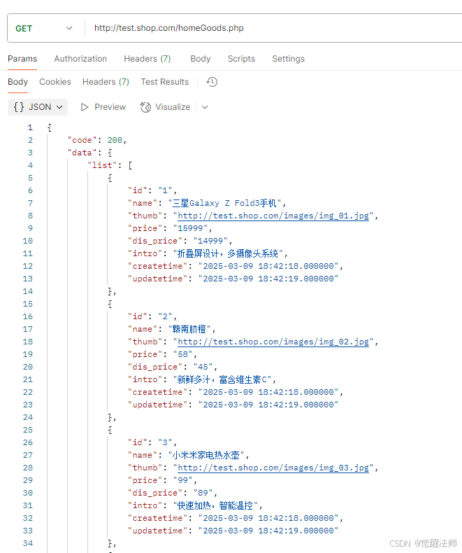
}通过postman查看数据结构,如下图:
6.4 HomeGoods组件
在src/main/ets/pages/Index/components/Goods.ets文件中,已成功获取推荐商品信息;接下,使用自定义构建函数,完成卡片式商品信息。示例代码如下:
import { getHomeGoods } from "../../../api"

@Component
export default struct HomeGoods {
  @State goods: Array<goodsInfo> = []

  aboutToAppear(): void {
    getHomeGoods().then(res => {
      if (res.code == 200 && res.data) {
        this.goods = res.data['list']
        // console.log('result', JSON.stringify(this.goods))
      }
    }).catch(() => {
      console.log('error')
    })
  }

  @Builder cardItem(item: goodsInfo) {
    Row({ space: 10 }){
      Column(){
        Image(item.thumb).width(100)  // 商品图片
      }
      Column(){
        // 商品标题
        Text(item.name).fontSize(16).fontWeight('bold')
        // 价格信息
        Row(){
          Text('价格:' + item.price).fontSize(18)
            .fontColor('#FF0000')
            .margin({ top: 10 })
          Text('原价:' + item.dis_price).fontSize(14)
            .fontColor('#999999')
            .margin({ left: 10 })
            .decoration({ type: TextDecorationType.LineThrough }) // 添加删除线
        }.alignItems(VerticalAlign.Bottom)
        // 介绍内容
        Text(item.intro).fontSize(14)
          .margin({ top: 15 })
      }.justifyContent(FlexAlign.Start)
       .layoutWeight(1)
      .alignItems(HorizontalAlign.Start)
    }.width('100%')
     .padding({ left: 10, right: 10 })
     .justifyContent(FlexAlign.Start) // 居左对齐
     .alignItems(VerticalAlign.Top)   // 顶部对齐
  }

  build() {
    Column({ space: 15 }){
      // 循环输出推荐商品信息,能使构建方法渲染卡片信息
      ForEach(this.goods, (item: goodsInfo, index) => {
        if (index > 0) {
          Divider() // 添加分割线
        }
        this.cardItem(item) // 渲染卡片
      })
    }.width('100%')
     .padding({ top: 15, bottom: 15 })
     .justifyContent(FlexAlign.Start)
  }
}
6.5 引入推荐商品
在首页中,引入推荐商品HomeGoods组件模块,示例代码如下:
import Header from '../../components/Header';
import Navi from '../../components/Navigation';
import Banner from './components/Banner';
import CategoryList from './components/Category';
import HomeGoods from './components/Goods';
@Entry
@Component
struct Index {
build() {
RelativeContainer() {
Flex({ direction: FlexDirection.Column, alignItems: ItemAlign.Center }){
Header() // 顶部导航
Row(){
// 将屏幕中 剩余调度,设置为中间内容区域的调度
// 这样可以使用Header和Navi组件,分别固定在页面的顶部和底部
Column(){
// 引入Banner图
Banner()
// 引入分类信息
CategoryList()
// 引入推荐商品
HomeGoods()
}.width('100%')
}.layoutWeight(1)
.width('100%')
.alignItems(VerticalAlign.Top)
.justifyContent(FlexAlign.Start)
// 底部菜单栏
Navi({ NavId: 1 })
}.width('100%')
.height('100%')
}
.height('100%')
.width('100%')
}
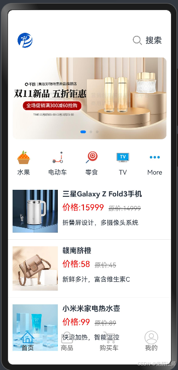
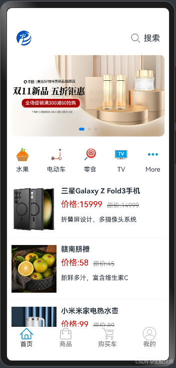
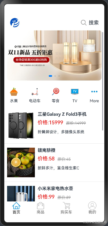
}页面效果如下图:
七、细节调整
如上图可见,虽然首页已完成,不过还存在一些问题,接下来将一一来解决。
7.1 底部菜单栏
如底部菜单栏与商品信息超出部分重叠了,这是因为底部菜单栏未添加背景色,添加后即可。
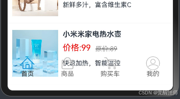
在底部菜单栏的Row()容器上,添加backgroundColor为白色。示例代码如下图:

页面效果如下图:
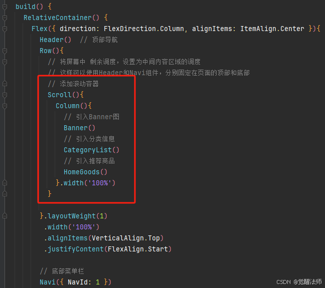
7.2 滚动效果
另一个问题则是,页面超出部分无法上拉进行滚动显示,这是因为Column()或Row()容器,不会因为内容超出,而自动添加滚动功能;方法有很有多种,大家可根据实际需求选择即可。
7.2 Scroll组件
在Column()容器外,再包裹一层Scroll组件即可,示例代码如下:
7.2 List容器
另外,在之前案例中,使用过的List()容器,结合ListItem()一起使用,也可以在内容超出后,实现滚动功能。示例代码如下:
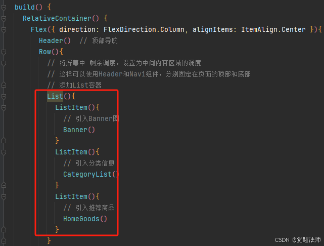
最终页面效果如下图:
首页中的五个组件在App应用中各自承担着不同的功能和作用,为用户提供了一些更便捷、高效、个性化的购买体验和通道。为用户更精细化的查找需求,提供多种选择方式。
这篇就先讲到这,如果有更好建议,欢迎随时沟通交流!