往期python绘图合集:
python绘制简单的折线图
python读取excel中数据并绘制多子图多组图在一张画布上
python绘制带误差棒的柱状图
python绘制多子图并单独显示
python读取excel数据并绘制多y轴图像
python绘制柱状图并美化|不同颜色填充柱子
准备数据
提示:这里可以添加本文要记录的大概内容:
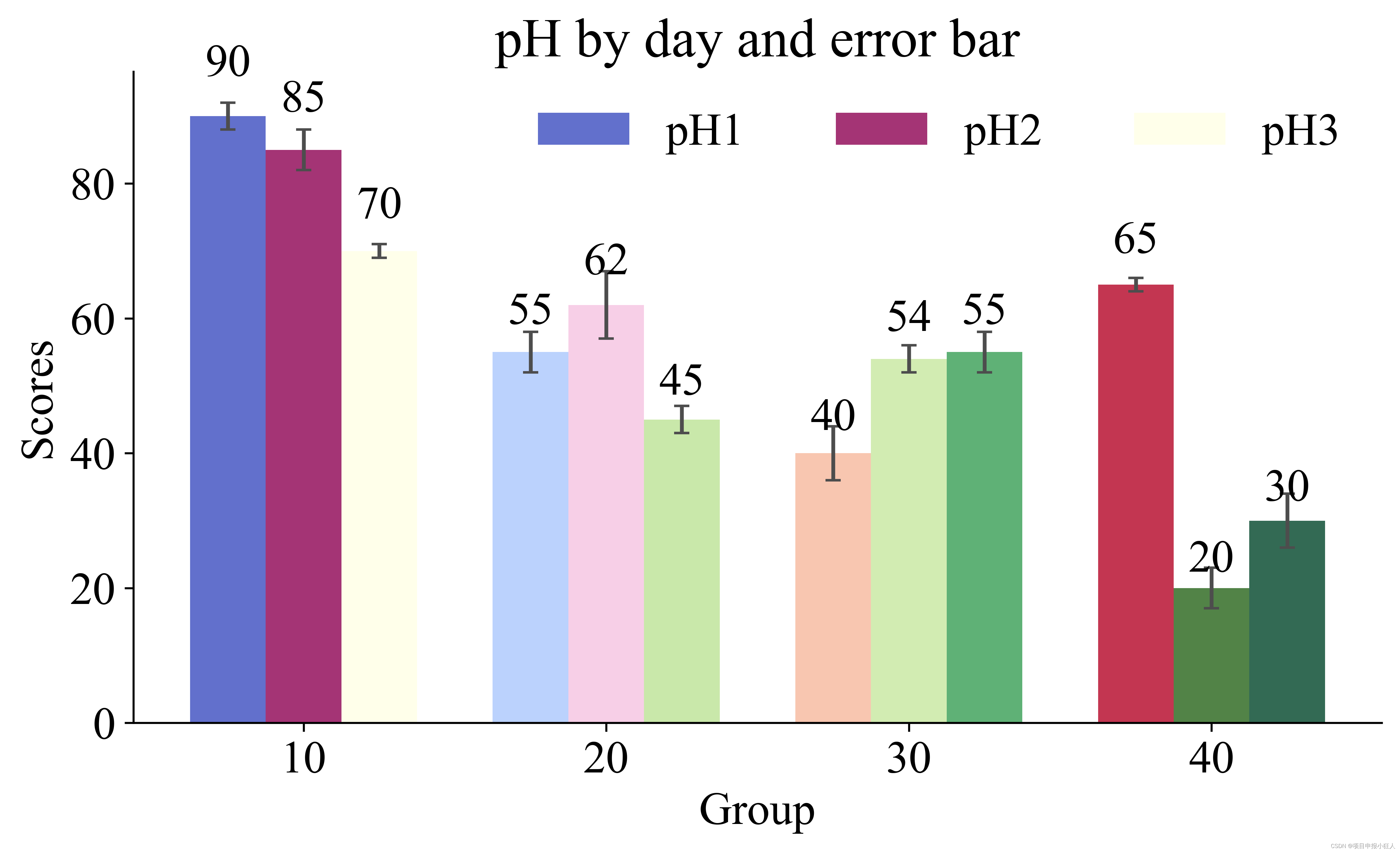
本文主要介绍如何使用Python中的matplotlib库绘制带误差棒的特别漂亮的三组柱状图。每个柱子一种渐变颜色,全局字体为新罗马,字体为蓝色,坐标轴字号新罗马,并设置数据显示在柱子上方中央。
首先,我们需要准备需要绘制的数据。在这里,我们使用numpy模块生成一些随机数据。下面是示例代码:
import numpy as np

# set seed for reproducibility
np.random.seed(12345)

n_groups = 4

# generate data for group 1
means_1 = np.random.randint(50, 100, n_groups)
stds_1 = np.random.randint(1, 5, n_groups)

# generate data for group 2
means_2 = np.random.randint(30, 80, n_groups)
stds_2 = np.random.randint(1, 5, n_groups)

# generate data for group 3
means_3 = np.random.randint(10, 60, n_groups)
stds_3 = np.random.randint(1, 5, n_groups)
首先使用numpy.random.seed()函数设置了随机数生成器的种子,以便于复现结果。然后,我们使用numpy.random.randint()函数生成了每组的4个数据和对应误差棒。
一、绘制图表
接下来就可以使用matplotlib库绘制带误差棒的三组柱状图
二、使用步骤
使用plt.rcParams[‘font.family’]和plt.rcParams[‘font.size’]函数设置全局字体和字号为新罗马和16号。接下来,我们使用cm.coolwarm、cm.PiYG和cm.YlGn函数分别获取三组颜色渐变,并使用np.linspace()函数将它们划分为4个区间。然后,我们分别用colors1、colors2和colors3变量保存了三组颜色。
接着,设置了柱状图的相关属性,包括柱宽、透明度和误差棒参数。然后,我们使用plt.subplots()函数创建一个包含图表和轴对象的Figure对象,并指定了图片大小。在图表上,首先创建了每个组的x轴刻度值index,然后使用ax.bar()函数绘制每个组的柱状图,每组柱子颜色采用不同的颜色渐变方案,并设置误差棒。最后,添加了标签、标题和图例,并设置了坐标轴字号为字体和字号。
最后,我们定义了函数autolabel(), 并分别对三组柱形图调用该函数,以便在每个柱子的顶部中央显示数据标签。该函数通过调用ax.text()函数实现。

1.引入库
import numpy as np
import matplotlib.pyplot as plt
from matplotlib import cm
2.完整代码
# -*- coding: utf-8 -*-
"""
Created on Sat May 13 13:08:36 2023

@author: ypzhao
"""


import numpy as np
import matplotlib.pyplot as plt
from matplotlib import cm

# 设置全局字体和字号
font = {

    'family': 'Times New Roman', 'size': 18}
plt.rc('font', **font)

# 设置柱状图数据样本
n_groups = 4
means_1 = (90, 55, 40, 65)
std_1 = (2, 3, 4, 1)

means_2 = (85, 62, 54, 20)
std_2 = (3, 5, 2, 3)

means_3 = (70, 45, 55, 30)
std_3 = (1, 2, 3, 4)

# 准备颜色渐变
cmap = plt.get_cmap('coolwarm')
colors_1 = [cmap(i) for i in np.linspace(0, 1, n_groups)]
cmap = plt.get_cmap('PiYG')
colors_2 = [cmap(i) for i in np.linspace(0, 1, n_groups)]
cmap = plt.get_cmap('YlGn')
colors_3 = [cmap(i) for i in np.linspace(0, 1, n_groups)]


# 绘制柱状图
fig, ax = plt.subplots(figsize=(8, 5),dpi=600)
index = np.arange(n_groups)
bar_width = 0.25

opacity = 0.8
error_config = {

    'ecolor': '0.3'}

rects1 = ax.bar(index, means_1, bar_width,capsize=3,
                alpha=opacity, color=colors_1,
                yerr=std_1, error_kw=error_config,
                label='pH1')

rects2 = ax.bar(index + bar_width, means_2, bar_width,capsize=3,
                alpha=opacity, color=colors_2,
                yerr=std_2, error_kw=error_config,
                label='pH2')

rects3 = ax.bar(index + 2*bar_width, means_3, bar_width,capsize=3,
                alpha=opacity, color=colors_3,
                yerr=std_3, error_kw=error_config,
                label='pH3')

# 添加数据标签(显示在柱子上方中央)
def autolabel(rects):
    for rect in rects:
        height = rect.get_height()
        ax.text(rect.get_x() + rect.get_width()/2., 1.05*height,
                '{:.0f}'.format(height),
                ha='center', va='bottom')

autolabel(rects1)
autolabel(rects2)
autolabel(rects3)

ax.spines['top'].set_visible(False)
ax.spines['right'].set_visible(False)


# 添加标签、标题和图例
ax.set_xlabel('Group',font)
ax.set_ylabel('Scores',font)
ax.set_title('pH by day and error bar')
ax.set_xticks(index + bar_width)
ax.set_xticklabels(('10', '20', '30', '40'))
ax.legend(loc='best',ncol=3,frameon=False)

# 设置坐标轴字号为新罗马
for tick in ax.xaxis.get_minor_ticks():
    tick.label1.set_fontsize(16)
    tick.label1.set_fontname('Times New Roman')

for tick in ax.yaxis.get_minor_ticks():
    tick.label1.set_fontsize(16)
    tick.label1.set_fontname('Times New Roman')

plt.tight_layout()
plt.show()
三、运行并修改
运行代码后,将会显示出带误差棒的三组柱状图,每个柱子一种渐变颜色,全局字体为新罗马,字体为蓝色,坐标轴字号新罗马,并且数据显示在柱子上方中央。