写移动端有一个监测功率的数据展示,要用表盘类型的图示,如下是效果:
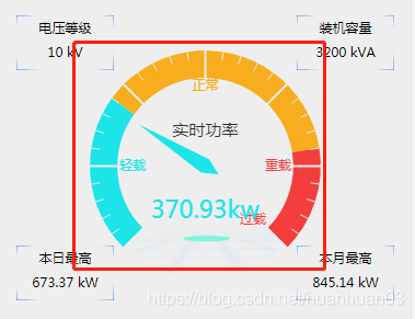
四角的数据那是自己写上去的,和echarts没关系,主要是中间的表盘:
drawLine (d) {         // 参数d是后台获取的当前功率
        let myChart = echarts.init(document.getElementById('lines'))    //  容器
        window.addEventListener("resize",function(){
            myChart.resize()
        })
        // this.infoList.t2
        // d
        myChart.setOption({
            tooltip : {
                formatter: "{a} <br/>{b} : {c}%"
            },
            series: [
                {
                    name: '功率指标',
                    type: 'gauge',
                    detail: {formatter:'{value}kw',fontSize: 22,},
                    data: [{value: d, name: '实时功率'}],           //  表盘中央显示的值和字
                    min:0,
                    max: 1300,    //设置刻度盘内数值最大值
                    splitNumber: 6,  //设置间隔区域的显示数量
                    axisLine: {            // 坐标轴线 色块
                        lineStyle: {       // 属性lineStyle控制线条样式
                            width: 25,
                            color: [[0.3, '#1ce4e8'], [0.8, '#f7ad1d'] , [1, '#f43d3d']]       //  此处是将表盘分成的块数,0-1之间的小数,后面的颜色是每块的背景色
                        }
                    },
                    axisLabel:{
                        distance: -3,         //  文字距表盘的距离
                        formatter:function(v){
                            let c = parseInt(v)
                            switch (c + '') {           // 这是每块的注释,算法是刻度最大值/设置间隔区域的显示数量,我这里是1300/6,具体显示位置自己根据需要调节
                                case '0' : return ' ';
                                case '216' : return '轻载';
                                case '650' : return '正常';
                                case '1083' : return '重载';
                                case '1300' : return '过载';
                            }
                        }
                    },
                    pointer: { //指针粗细
                      width: 7,
                      length: '68%'
                    },
                    title: {
                offsetCenter: [0, '-30%'],       // x, y,单位px
            },
                }
            ]
        })
    }
所有的注释我都在代码上做了标识,如果还有疑问可以看官网示例Echarts
