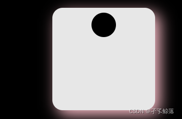
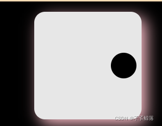
1.单项目布局
一个
<!DOCTYPE html>
<html lang="en">
<head>
<meta charset="UTF-8">
<meta http-equiv="X-UA-Compatible" content="IE=edge">
<meta name="viewport" content="width=device-width, initial-scale=1.0">
<title>Document</title>
<style>
#body{
background-color: black;
}
.cont{
width: 210px;
height: 210px;
margin: 20px auto;
background-color: #e7e7e7;
border-radius: 10%;
box-shadow:red;
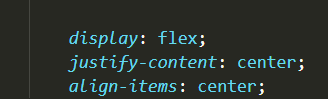
display: flex;
}
.cont span{
width: 50px;
height: 50px;
margin: 10px;
background-color: black;
border-radius: 100%;
}
</style>
</head>
<body id="body">
<div class="cont">
<span></span>
</div>
</body>
</html>
运行结果

换一个地方

然后

然后
然后


然后
然后
然后

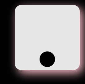
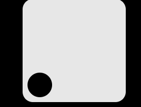
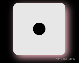
2.双项目布局
第一种
<!DOCTYPE html>
<html lang="en">
<head>
    <meta charset="UTF-8">
    <meta http-equiv="X-UA-Compatible" content="IE=edge">
    <meta name="viewport" content="width=device-width, initial-scale=1.0">
    <title>筛子的双项目</title>
    <style>
        #body{


            background-color: black;
        }
        .cont{


            width: 210px;
            height: 210px;
            margin: 20px auto;
            background-color: #e7e7e7;
            border-radius: 10%;
            box-shadow: 10px 10px 30px pink;

            display: flex;
        }
        .cont span{


            width: 50px;
            height: 50px;
            margin: 10px;
            background-color: black;
            border-radius: 100%;
        }
    </style>
</head>
<body id="body">
    <div class="cont">
        <span></span>
        <span></span>
    </div>
</body>
</html>
运行结果
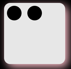
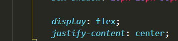
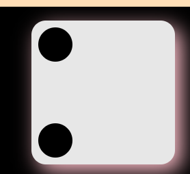
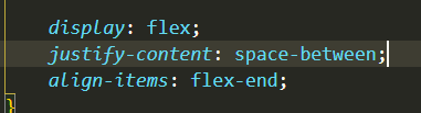
第二种
display: flex;
justify-content: space-between;

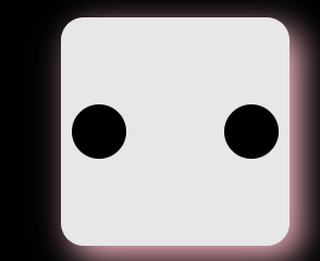
第三种
第四种

第五种

第六种
<!DOCTYPE html>
<html lang="en">
<head>
<meta charset="UTF-8">
<meta http-equiv="X-UA-Compatible" content="IE=edge">
<meta name="viewport" content="width=device-width, initial-scale=1.0">
<title>筛子的双项目</title>
<style>
#body{
background-color: black;
}
.cont{
width: 210px;
height: 210px;
margin: 20px auto;
background-color: #e7e7e7;
border-radius: 10%;
box-shadow: 10px 10px 30px pink;
display: flex;
}
.cont span{
width: 50px;
height: 50px;
margin: 10px;
background-color: black;
border-radius: 100%;
}
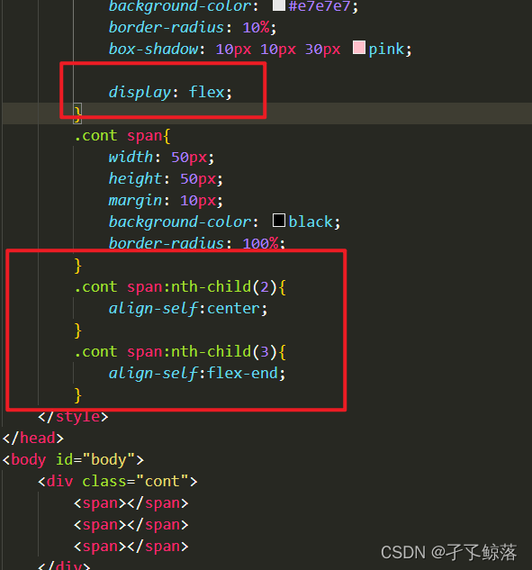
.cont span:nth-child(2){
align-self: center;
}
</style>
</head>
<body id="body">
<div class="cont">
<span></span>
<span></span>
</div>
</body>
</html>
运行结果

第七种


3.三项目的
第一种

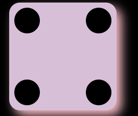
4.四项目的
第一种
第二种
<!DOCTYPE html>
<html lang="en">

<head>
    <meta charset="UTF-8">
    <meta http-equiv="X-UA-Compatible" content="IE=edge">
    <meta name="viewport" content="width=device-width, initial-scale=1.0">
    <title>hhh</title>
    <style>
        body{


            background-color: black;
        }

        .box {


            margin: 20px auto;
            width: 210px;
            height: 210px;
            background-color: thistle;
            border-radius: 10%;
            box-shadow: 10px 10px  20px pink;

            display: flex;
            flex-wrap: wrap;
            align-content: space-between;

        }

        .column {


            flex-basis: 100%;
            display: flex;
            justify-content: space-between;
        }

        .box span{


            width: 50px;
            height: 50px;
            border-radius: 100%;
            margin: 10px;
            background-color: black;
        }
    </style>
</head>

<body>
    <div class="box">
        <div class="column">
            <span class="item"></span>
            <span class="item"></span>
        </div>
        <div class="column">
            <span class="item"></span>
            <span class="item"></span>
        </div>
    </div>
</body>

</html>