先上效果图

整个页面分为6骰子的面,分别为点数1到6
    <div class="dice">
        <!-- 点数1 -->
        <div class="points points-1"></div>
        <!-- 点数2 -->
        <div class="points points-2"></div>
        <!-- 点数3 -->
        <div class="points points-3"></div>
        <!-- 点数4 -->
        <div class="points points-4"></div>
        <!-- 点数5 -->
        <div class="points points-5"></div>
        <!-- 点数6 -->
        <div class="points points-6"></div>
    </div>


.dice {
    background: #000;
    display: flex;
    flex-wrap: wrap;
    .points {
        width: 100px;
        height: 100px;
        background: #fff;
        border-radius: 20px;
        margin: 100px;
        padding: 15px;
    }
}
点数1:典型的居中布局
思路:让其子元素分别在主轴和交叉轴上居中,用justify-content和align-items
        <!-- 点数1 -->
        <div class="points points-1">
            <div class="item item-1"></div>
        </div>


    .points-1 {
        display: flex;
        justify-content: center;
        align-items: center;
    }

    .item-1{
        width: 30px;
        height: 30px;
        background: #f90821;
    }
点数2: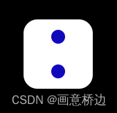
思路:首先是纵向布局flex-direction: column,并且主轴方向将其两端对齐justify-content: space-between(也就是上下靠边),然后再设置居中对齐align-items: center
        <!-- 点数2 -->
        <div class="points points-2">
            <div class="item item-2"></div>
            <div class="item item-2"></div>
        </div>


    .points-2 {
        display: flex;
        flex-direction: column;
        justify-content: space-between;
        align-items: center;
    }
点数3:
思路:首先是纵向布局flex-direction: column,并且主轴方向将其两端对齐justify-content: space-between(也就是上下靠边),然后将第二个子元素居中对齐align-self: center,第三个子元素靠后对齐align-self: end
        <!-- 点数3 -->
        <div class="points points-3">
            <div class="item item-3"></div>
            <div class="item item-3"></div>
            <div class="item item-3"></div>
        </div>

    .points-3 {
        display: flex;
        flex-direction: column;
        justify-content: space-around;
        .item-3:nth-child(2) {
            align-self: center;
        }
        .item-3:nth-child(3) {
            align-self: end;
        }
    }