目录

一,体验
了解flex布局、它与传统布局的区别及应用场景
对比:
传统布局:
- 兼容性好、布局繁琐、浮动(清除浮动)
- 有局限性不能在移动端很好的布局
flex布局:
- 操作方便,布局极其简单,移动端使用比较广泛
- PC端浏览器支持情况比较差
使用:
- 如果是PC端页面布局,采用传统方式;如果是移动端或者是不考虑兼容的PC端则采用flex布局;
特点:
- 任何一个标签都可以指定使用 flex 布局。
- 当为父标签设为 flex 布局以后,子元素的 float、clear 和 vertical-align 属性将失效。
- 使用思想上和传统盒子完全不同,不要再想子元素是块级元素、行内元素。
- flex通过行和列的思路来控制布局;
名称:
- 采用 flex 布局的元素,称为 flex 容器(flexcontainer),父级简称"容器"。
- 它的所有子元素自动成为容器成员,称为 flex 项目(flexitem),简称"项目"。
语法:flex布局入口,加在容器上
display:flex;举例:实现单行项目的水平、垂直居中

<!DOCTYPE html>
<html lang="en">

<head>
    <meta charset="UTF-8">
    <meta name="viewport" content="width=device-width, initial-scale=1.0">
    <title>Document</title>
    <style>
        /* 容器 */
        .obox {
            width: 100%;
            height: 300px;
            border: 1px solid #222;
            /* flex布局 */
            display: flex;
            /* 水平居中 两端对齐居中 */
            justify-content: space-between;
            /* 单行垂直居中 */
            align-items: center;
        }

        /* 项目 */
        .os {
            width: 200px;
            height: 200px;
            background: red;
            margin: 5px;
        }
    </style>
</head>

<body>
    <div class="obox">
        <div class="os"></div>
        <div class="os"></div>
        <div class="os"></div>
        <div class="os"></div>
    </div>
</body>

</html>
二,flex-direction
作用:确认主轴的选择
特点:把主轴确认,元素默认按照确认的主轴方向进行排布
语法:
flex-direction:row /* 默认值 从左到右 */| row | 默认值从左到右 |
| row-reverse | 从右到左 |
| column | 从上到下 |
| column-reverse | 从下到上 |
特点:
默认:主轴: x 轴方向,水平向右;侧轴:是y 轴方向,水平向下;
举例:展示flex的四种排列方向。

<!DOCTYPE html>
<html lang="en">

<head>
    <meta charset="UTF-8">
    <meta name="viewport" content="width=device-width, initial-scale=1.0">
    <title>Document</title>
    <style>
        .obox {
            width: 800px;
            height: 600px;
            border: 1px solid #222;
            /* 容器 */
            display: flex;
            /* flex-direction 让元素按照主轴的方向进行排列 */
            /* 默认是row 从左到右 */
            /* flex-direction: row; */
            /* 从右到左 */
            /* flex-direction: row-reverse; */
            /* 从上到下 */
            /* flex-direction: column; */
            /* 从下到上 */
            flex-direction: column-reverse;

        }

        .os {
            width: 100px;
            height: 100px;
            background: red;
        }
    </style>
</head>

<body>
    <div class="obox">
        <div class="os">1</div>
        <div class="os">2</div>
        <div class="os">3</div>
        <div class="os">4</div>
    </div>
</body>

</html>
三,justify-content
单词justify:整理版面
作用:控制主轴上的元素的各种各样的对齐方式
类似:word里的左对齐,右对齐,居中对齐,分散对齐;
语法
justify-content:flex-start| flex-start | 默认值从头部开始如果主轴是x轴,则从左到右 |
| flex-end | 从尾部开始排列 |
| center | 在主轴居中对齐(如果主轴是x轴则水平居中) |
| space-around | 平分剩余空间 |
| space- between | 先两边贴边再平分剩余空间(重要) |
举例:列举整理版面的几种方法

<!DOCTYPE html>
<html lang="en">

<head>
    <meta charset="UTF-8">
    <meta name="viewport" content="width=device-width, initial-scale=1.0">
    <title>Document</title>
    <style>
        .obox {
            width: 800px;
            height: 600px;
            border: 1px solid #222;
            /* 容器 */
            display: flex;
            /* justify-content 控制元素在主轴上对齐的方式 */
            justify-content: flex-start;
            /* 尾部对齐 */
            justify-content: flex-end;
            /* 居中对齐 */
            justify-content: center;
            /* 平分剩余空间 */
            justify-content: space-around;
            /* 先两边在平分剩余空间 */
            justify-content: space-between;
        }

        .os {
            width: 100px;
            height: 100px;
            background: red;
        }
    </style>
</head>

<body>
    <div class="obox">
        <div class="os">1</div>
        <div class="os">2</div>
        <div class="os">3</div>
        <div class="os">4</div>
    </div>
</body>

</html>
四,flex-wrap和align-items
1,flex-wrap
作用:控制子元素是否换行;
语法:
/* 默认值 不换行;子项目加起来的宽度超过父级的宽度时,子项宽度会被缩小,宽度只是不生效,必须设置 */
flex-wrap:nowrap;
/* 换行; 子项的总宽加起来超过父级宽度,就会换行*/
flex-wrap:wrap;
举例:展示item是否换行


<!DOCTYPE html>
<html lang="en">

<head>
    <meta charset="UTF-8">
    <meta name="viewport" content="width=device-width, initial-scale=1.0">
    <title>Document</title>
    <style>
        .obox {
            width: 600px;
            height: 600px;
            border: 1px solid #222;
            /* 容器 */
            display: flex;
            /* 不换行 */
            /* flex-wrap: nowrap; */
            /* 换行 */
            flex-wrap: wrap;
        }

        .os {
            width: 200px;
            height: 200px;
            background: red;
            margin: 5px;
        }
    </style>
</head>

<body>
    <div class="obox">
        <div class="os">1</div>
        <div class="os">2</div>
        <div class="os">3</div>
        <div class="os">4</div>
    </div>
</body>

</html>
2,align-items
该属性是控制子项单行在侧轴(默认是y轴)上的对齐方式,在子项为单项(单行)的时候使用;
整体一行元素看成整体,设置在侧轴上的对齐方式
语法:
| flex-start | 默认值从上到下 |
| flex-end | 从下到上 |
| center | 挤在一起居中(垂直居中) |
| stretch | 拉伸 |
注意: stretch如果项目未设置高度或设为auto将占满整个容器的高度
举例:展示item在侧轴上的对齐方式
<!DOCTYPE html>
<html lang="en">

<head>
    <meta charset="UTF-8">
    <meta name="viewport" content="width=device-width, initial-scale=1.0">
    <title>Document</title>
    <style>
        .obox {
            width: 600px;
            height: 600px;
            border: 1px solid #222;
            /* 容器 */
            display: flex;
            /* align-item 单行 在y轴的对齐方式 */
            /* 默认的是flex-start 从上到下 */
            align-items: flex-start;
            /* 从下到上 */
            /* 从下到上 */
            align-items: flex-end;
            /* 居中 */
            align-items: center;
            /* 拉伸 */
            align-items: stretch;
        }

        .os {
            width: 100px;
            /* height: 100px; */
            background: red;
            margin: 5px;
        }
    </style>
</head>

<body>
    <div class="obox">
        <div class="os">1</div>
        <div class="os">2</div>
        <div class="os">3</div>
        <div class="os">4</div>
    </div>
</body>

</html>
五,align-content
设置子项在侧轴上的排列方式 ,并且只能用于子项出现换行的情况或者多行
语法:
| flex-start | 默认值在侧轴的头部开始排列 |
| flex-end | 在侧轴的尾部开始排列 |
| center | 在侧轴中间显示 |
| space- around | 子项在侧轴平分剩余空间 |
| space-between | 子项在侧轴先分布在两头,再平分剩余空间 |
| stretch | 设置子项元素高度平分父元素高度 |
注意: 容器内必须有多行的项目,该属性才能渲染出效果。
举例:
<!DOCTYPE html>
<html lang="en">

<head>
    <meta charset="UTF-8">
    <meta name="viewport" content="width=device-width, initial-scale=1.0">
    <title>Document</title>
    <style>
        .obox {
            width: 600px;
            height: 600px;
            border: 1px solid #222;
            /* 容器 */
            display: flex;
            flex-wrap: wrap;
            /* align-content 侧轴上多行情况排列方式 */
            /* 多行对齐 */
            /* align-content: flex-start; */
            /* 从下面对齐 */
            /* align-content: flex-end; */
            /* 中间对齐 */
            /* align-content: center; */
            /* 平均分 */
            /* align-content: space-around; */
            /* 先两边 后中间平均分 */
            /* align-content: space-between; */
            /* 侧轴平均分多行 */
            align-content: stretch;
        }

        .os {
            width: 200px;
            /* height: 200px; */
            background: red;

        }
    </style>
</head>

<body>
    <div class="obox">
        <div class="os">1</div>
        <div class="os">2</div>
        <div class="os">3</div>
        <div class="os">4</div>
    </div>
</body>

</html>
六,flex
作用:子元素去占有 (划分)在主轴上的 剩余空间
语法
.item { // 百分比或者是1~10的数字
    flex: 20% 或者 2;
}
举例:
<!DOCTYPE html>
<html lang="en">

<head>
    <meta charset="UTF-8">
    <meta name="viewport" content="width=device-width, initial-scale=1.0">
    <title>Document</title>
    <style>
        .obox {
            width: 600px;
            height: 100px;
            border: 1px solid red;
            display: flex;
        }

        /* 项目属性 */
        .os1 {
            background: yellow;
            flex: 20%;
        }

        .os2 {
            background: #ccc;
            flex: 80%;
        }
    </style>
</head>

<body>
    <div class="obox">
        <div class="os1">1</div>
        <div class="os2">2</div>
    </div>
</body>

</html>
七,align-self
作用:控制子项,自己在侧轴上的对齐方式;
特点:
默认值auto,父级设置了align-items ,auto继承父级元素上设置侧轴的对齐方式:align-items 属性;
如果父级没有设置align-items 属性,auto默认值会变为strecth;
语法:
| flex-start | 默认值从上到下 |
| flex-end | 从下到上 |
| center | 挤在一起居中(垂直居中) |
| stretch | 拉伸 |
举例:
<!DOCTYPE html>
<html lang="en">

<head>
    <meta charset="UTF-8">
    <meta name="viewport" content="width=device-width, initial-scale=1.0">
    <title>Document</title>
    <style>
        .obox {
            width: 600px;
            height: 100px;
            border: 1px solid #222;
            display: flex;
            /* 容器侧轴上的对齐 */
            /* align-items: center; */
        }

        .os {
            width: 50px;
            /* height: 50px; */
            align-self: stretch;
            background: red;
        }
    </style>
</head>

<body>
    <div class="obox">
        <div class="os">1</div>
        <div class="os">2</div>
        <div class="os">3</div>
        <div class="os">4</div>
    </div>
</body>

</html>
八,导航栏
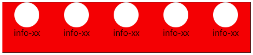
分析:
整体:
- 确认主轴 水平向右
单独一个元素
- 整体单个元素:flex布局
- 确认主轴: Y轴 列
- 侧轴对齐: 居中
举例:通过flex实现导航栏

<!DOCTYPE html>
<html lang="en">

<head>
    <meta charset="UTF-8">
    <meta name="viewport" content="width=device-width, initial-scale=1.0">
    <title>Document</title>
    <style>
        .obox {
            width: 600px;
            height: 200px;
            border: 1px solid #222;
            display: flex;
        }

        .obox>div {
            flex: 1;/* 平分整个容器 */
            background: blue;
            display: flex;
            flex-direction: column;
            align-items: center;
        }

        .oimg {
            width: 50px;
            height: 50px;
            background: pink;
            border-radius: 50%;
            margin: 15px 0;
        }
    </style>
</head>

<body>
    <div class="obox">
        <div class="oson">
            <span class="oimg"></span>
            <span class="info">大娃</span>
        </div>
        <div class="oson">
            <span class="oimg"></span>
            <span class="info">二娃</span>
        </div>
        <div class="oson">
            <span class="oimg"></span>
            <span class="info">三娃</span>
        </div>
    </div>
</body>

</html>
章节汇总在这里(づ ̄3 ̄)づ╭❤~@&再见萤火虫&【04-前端技术】
对学习Java感兴趣的同学欢迎加入QQ学习交流群:1126298731
有问题欢迎提问,大家一起在学习Java的路上打怪升级!(o゜▽゜)o☆[BINGO!]