目录
之前在legend的使用中,便已经提及了transforms,用来转换参考系,一般情况下,我们不会用到这个,但是还是了解一下比较好
| 坐标 | 转换对象 | 描述 |
|---|---|---|
| "data" | ax.transData | 数据的坐标系统,通过xlim, ylim来控制 |
| "axes" | ax.transAxes | Axes的坐标系统,(0, 0)代表左下角,(1, 1)代表右上角 |
| "figure" | fig.transFigure | Figure的坐标系统,(0, 0)代表左下角,(1, 1)代表右上角 |
| "figure-inches" | fig.dpi_scale_trans | 以inches来表示的Figure坐标系统,(0, 0)左下角,而(width, height)表示右上角 |
| "display" | None or IdentityTransform() | 显示窗口的像素坐标系统,(0, 0)表示窗口的左下角,而(width, height)表示窗口的右上角 |
| "xaxis", "yaxis" | ax.get_xaxis_transform(), ax.get_yaxis_transform() | 混合坐标系; 在另一个轴和轴坐标之一上使用数据坐标。没看懂 |
Data coordinates
最为常见的便是通过set_xlim, 和set_ylim来控制数据坐标
import numpy as np
import matplotlib.pyplot as plt
import matplotlib.patches as mpatches

x = np.arange(0, 10, 0.005)
y = np.exp(-x/2.) * np.sin(2*np.pi*x)

fig, ax = plt.subplots()
ax.plot(x, y)
ax.set_xlim(0, 10)
ax.set_ylim(-1, 1)

plt.show()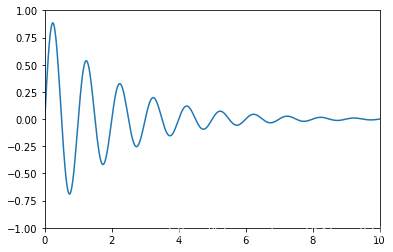
你可以通过ax.transData来将你的数据坐标,转换成再显示窗口上的像素坐标,单个坐标,或者传入序列都是被允许的
type(ax.transData)matplotlib.transforms.CompositeGenericTransformax.transData.transform((5, 0)) #数据坐标(5, 0) 转换为显示窗口的像素坐标(221.4, 144.72) 这个玩意儿不一定的array([221.4 , 144.72])ax.transData.transform(((5, 0), (2, 3)))array([[221.4 , 144.72],
[120.96, 470.88]])你也可以通过使用inverted()来反转,获得数据坐标
inv = ax.transData.inverted()type(inv)matplotlib.transforms.CompositeGenericTransforminv.transform((221.4, 144.72))array([5., 0.])下面是一个比较完整的例子
x = np.arange(0, 10, 0.005)
y = np.exp(-x/2.) * np.sin(2*np.pi*x)

fig, ax = plt.subplots()
ax.plot(x, y)
ax.set_xlim(0, 10)
ax.set_ylim(-1, 1)

xdata, ydata = 5, 0
xdisplay, ydisplay = ax.transData.transform_point((xdata, ydata))

bbox = dict(boxstyle="round", fc="0.8")
arrowprops = dict(
    arrowstyle="->",
    connectionstyle="angle,angleA=0,angleB=90,rad=10")

offset = 72
ax.annotate('data = (%.1f, %.1f)' % (xdata, ydata),
            (xdata, ydata), xytext=(-2*offset, offset), textcoords='offset points',
            bbox=bbox, arrowprops=arrowprops)

disp = ax.annotate('display = (%.1f, %.1f)' % (xdisplay, ydisplay),
                   (xdisplay, ydisplay), xytext=(0.5*offset, -offset), #xytext 好像是text离前面点的距离
                   xycoords='figure pixels', #这个属性来变换坐标系
                   textcoords='offset points',
                   bbox=bbox, arrowprops=arrowprops)

plt.show()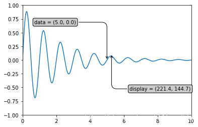
很显然的一点是,当我们改变xlim, ylim的时候,同样的数据点转换成显示窗口后发生变化
ax.transData.transform((5, 0))array([221.4 , 144.72])ax.set_ylim(-1, 2)(-1, 2)ax.transData.transform((5, 0))array([221.4 , 108.48])ax.set_xlim(10, 20)(10, 20)ax.transData.transform((5, 0))array([-113.4 , 108.48])Axes coordinates
除了数据坐标系,Axes坐标系是第二常用的,就像在上表中提到的(0, 0)表示左下角,而(1, 1)表示右上角,(0.5, 0.5)则表示中心。我们也可以过分一点,使用(-0.1, 1.1)会显示在axes的外围左上角部分。
fig = plt.figure()
for i, label in enumerate(('A', 'B', 'C', 'D')):
    ax = fig.add_subplot(2, 2, i+1)
    ax.text(0.05, 0.95, label, transform=ax.transAxes,
            fontsize=16, fontweight='bold', va='top')

plt.show()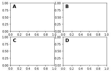
从上面的例子中我们可以看到,想在多个axes中相同的位置放置相似的东西,用ax.transAxes时非常方便的
fig, ax = plt.subplots()
x, y = 10*np.random.rand(2, 1000)
ax.plot(x, y, 'go', alpha=0.2)  # plot some data in data coordinates

circ = mpatches.Circle((0.5, 0.5), 0.25, transform=ax.transAxes,
                       facecolor='blue', alpha=0.75)
ax.add_patch(circ)
plt.show()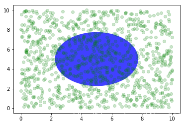
可以看到,上面的椭圆与数据坐标无关,始终放置在中间
Blended transformations 混合坐标系统
import matplotlib.transforms as transforms

fig, ax = plt.subplots()
x = np.random.randn(1000)

ax.hist(x, 30)
ax.set_title(r'$\sigma=1 \/ \dots \/ \sigma=2$', fontsize=16)

# the x coords of this transformation are data, and the
# y coord are axes
trans = transforms.blended_transform_factory(
    ax.transData, ax.transAxes)

# highlight the 1..2 stddev region with a span.
# We want x to be in data coordinates and y to
# span from 0..1 in axes coords
rect = mpatches.Rectangle((1, 0), width=1, height=1,
                         transform=trans, color='yellow',
                         alpha=0.5)

ax.add_patch(rect)

plt.show()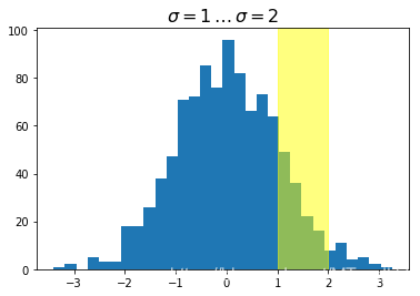
注意到,上面我们使用了混合坐标系统,x轴方向是数据坐标系,而y轴方向是axes的坐标系统,我们做一个反转试试
import matplotlib.transforms as transforms

fig, ax = plt.subplots()
x = np.random.randn(1000)

ax.hist(x, 30)
ax.set_title(r'$\sigma=1 \/ \dots \/ \sigma=2$', fontsize=16)

# the x coords of this transformation are data, and the
# y coord are axes
trans = transforms.blended_transform_factory(
    ax.transAxes, ax.transData) #调了一下

# highlight the 1..2 stddev region with a span.
# We want x to be in data coordinates and y to
# span from 0..1 in axes coords
rect = mpatches.Rectangle((0.5, 0), width=0.5, height=50,  #注意这里的区别
                         transform=trans, color='yellow',
                         alpha=0.5)

ax.add_patch(rect)

plt.show()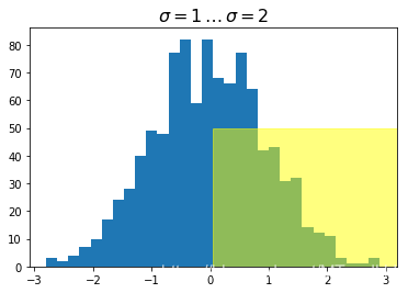
plotting in physical units
fig, ax = plt.subplots(figsize=(5, 4))
x, y = 10*np.random.rand(2, 1000)
ax.plot(x, y*10., 'go', alpha=0.2)  # plot some data in data coordinates
# add a circle in fixed-units
circ = mpatches.Circle((2.5, 2), 1.0, transform=fig.dpi_scale_trans,
                       facecolor='blue', alpha=0.75)
ax.add_patch(circ)
plt.show()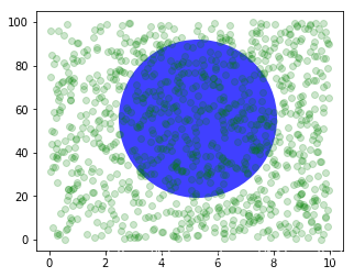
上面的圆使用了transform=fig.dpi_scale_trans坐标系统,其圆心为(2.5, 2),半径为1,显然这些都是以figsize为基准的,所以,这个圆会在图片中心,如果我们变换figsize,图片的位置(显示位置)会发生变化
fig, ax = plt.subplots(figsize=(7, 2))
x, y = 10*np.random.rand(2, 1000)
ax.plot(x, y*10., 'go', alpha=0.2)  # plot some data in data coordinates
# add a circle in fixed-units
circ = mpatches.Circle((2.5, 2), 1.0, transform=fig.dpi_scale_trans,
                       facecolor='blue', alpha=0.75)
ax.add_patch(circ)
plt.show()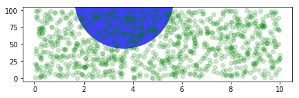
再来看一个有趣的例子,虽然我不知道改如何解释
fig, ax = plt.subplots()
xdata, ydata = (0.2, 0.7), (0.5, 0.5)
ax.plot(xdata, ydata, "o")
ax.set_xlim((0, 1))

trans = (fig.dpi_scale_trans +
         transforms.ScaledTranslation(xdata[0], ydata[0], ax.transData))

# plot an ellipse around the point that is 150 x 130 points in diameter...
circle = mpatches.Ellipse((0, 0), 150/72, 130/72, angle=40,
                          fill=None, transform=trans)
ax.add_patch(circle)
plt.show()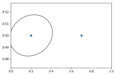
注意上面trans后面有个+号,这个表示,显示用dpi_scale_trans,即在图片(0, 0)也就是左下角位置画一个大小合适的椭圆,然后将这个椭圆移动到(x[data][0], y[data][0])位置处,感觉实现是椭圆上点每个都加上(xdata[0], ydata[0])
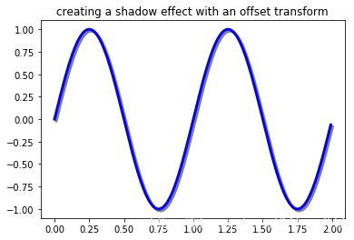
使用offset transforms 创建阴影效果
fig, ax = plt.subplots()

# make a simple sine wave
x = np.arange(0., 2., 0.01)
y = np.sin(2*np.pi*x)
line, = ax.plot(x, y, lw=3, color='blue')

# shift the object over 2 points, and down 2 points
dx, dy = 2/72., -2/72.
offset = transforms.ScaledTranslation(dx, dy, fig.dpi_scale_trans)
shadow_transform = ax.transData + offset

# now plot the same data with our offset transform;
# use the zorder to make sure we are below the line
ax.plot(x, y, lw=3, color='gray',
        transform=shadow_transform,
        zorder=0.5*line.get_zorder())

ax.set_title('creating a shadow effect with an offset transform')
plt.show()